
Friday afternoon, a factory manager notices that the warning boards around a CNC bay have faded, scratched faces and lifting edges. An external auditor is due on Monday, production can't stop, and procurement needs replacements that will look right on the wall and remain readable after the next wash-down, solvent spill or impact.
That pressure exposes the difference between a safety signage board that exists and one that performs. A board must communicate the hazard quickly, use the recognised Australian visual language, withstand its environment and remain discoverable when people are moving, tired or distracted. Paper compliance is only the starting point. Wayfinding performance is what workers and visitors experience on the floor.
What a Safety Signage Board Has to Do on a Working Site
The first replacement question shouldn't be, “Can we print the same artwork again?” It should be, “Why did the original board fail?” A faded face may point to sustained ultraviolet exposure. A curled corner may indicate an unsuitable adhesive. A scratched legend may show that a surface-printed label was placed inside an impact zone. Each failure changes the specification for the replacement.
On a working site, the board has several jobs at once:
- Communicate the hazard: A worker should understand the instruction from the pictogram and colour before reading a long sentence.
- Survive the location: The face must tolerate the site's worst combination of UV, chemicals, abrasion, moisture, cleaning and accidental contact.
- Support movement: Staff and visitors need to recognise the message while approaching a doorway, crossing, plant room or emergency resource.
- Stay consistent: Repeated sign families and mounting positions help people build an intuitive mental map across shifts.
A board that looks acceptable in a procurement file may fail in practice. It can be technically legible at close range but unreadable from the approach route. It can use the correct colour yet disappear in glare. It can carry the right wording while sitting behind pipework, a guardrail or a temporary pallet.
Production rule: Specify the sign for the worst hour of its year, not the average conditions on the day it is quoted.
Compliance and discoverability are different tests
Australian workplace signage has a long technical lineage. The foundational standard began as CZ4-1952, became AS 1319-1972 in 1972, was revised in 1979 and 1983, and became AS 1319-1994. WorkSafe ACT identifies AS 1319-1994 as the current Australian Standard covering safety signs for work environments, and the standard was reconfirmed in 2018 as still valid and not requiring major revision. WorkSafe ACT outlines the Australian signage framework.
That continuity matters, but it doesn't answer every site-side question. The standard gives the production team the grammar. The manager still has to check whether a board is visible from the decision point, whether lighting destroys contrast and whether maintenance keeps the message clear.
A useful acceptance test is simple: stand where a worker first needs the information, view the board under normal lighting and ask whether the symbol can be identified without stopping. If the answer is no, changing the wording alone won't solve the problem.
AS 1319 Sign Families and What Each Colour Means
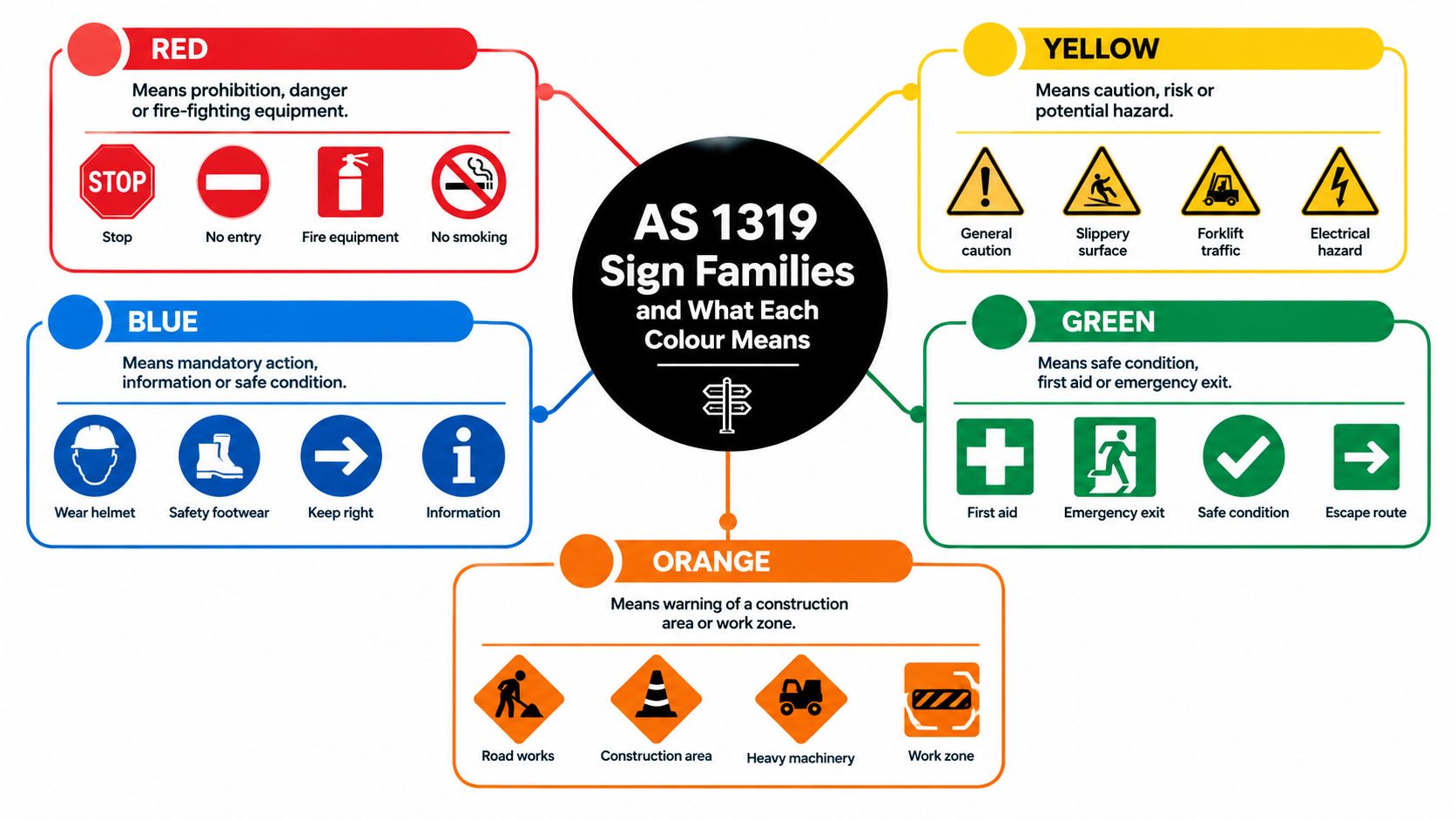
AS 1319 uses colour, shape and symbol together. The visual code should carry the first layer of meaning, while supplementary words confirm the action or location. That approach is more reliable than relying on text alone, especially where people speak different first languages or approach from an angle.
Start with the sign family
Red prohibition signs use a circle and diagonal bar to show that an action or entry is forbidden. A “No entry” board on a boilermaker workshop doorway should be recognised before someone reaches the threshold.
Yellow warning signs use the familiar diamond form to flag a hazard or caution. “Mind your head” beneath a low crane beam is a practical example. The yellow field should remain distinct from nearby plant colours, dirt and reflective glare.
Blue mandatory signs use a solid blue circle to require an action. At a grinding station, an eye-protection instruction should be understood as a condition of entry or work, not a suggestion.
Green emergency or safe-condition signs use a square or rectangle for information such as first aid, emergency exits and safe routes. A running-person pictogram or first-aid symbol helps people under pressure.
The AS 1319 product information from Standards Australia confirms the standard's role in safety-sign design, but the practical specification still needs judgement. Symbol size, viewing distance, mounting position and surrounding obstruction determine whether the sign works on your site.
Supplementary information signs add wording, arrows, location details or hazard descriptions. Fire equipment identification also needs to align with the relevant fire-signage approach under AS 2444. Don't let a custom brand treatment weaken the recognised sign family. A logo, decorative border or unusual colour may look polished in a brochure but can slow recognition on a busy factory floor.
For procurement, the safest sequence is:
- Identify the required sign family.
- Select the recognised pictogram.
- Add only the wording needed to remove ambiguity.
- Confirm the sign can be read and recognised from the approach route.
- Freeze the artwork before choosing the substrate.
The colour-and-shape system is the compliance foundation. Production decisions determine whether that foundation remains visible.
Choosing the Right Substrate for the Environment
A substrate should be selected against failure modes, not catalogue descriptions. An indoor control-panel label and a board beside a coastal loading area may carry identical wording, but they shouldn't be specified the same way.
Anodised aluminium is a strong general industrial choice. Laser marking removes or changes the anodised layer to create a permanent graphic, and the face handles UV and many chemical exposures well. The weaknesses are mechanical. A thin sheet can bend on impact, and an unprotected raw edge may corrode in a salt-exposed yard.
Colour-core two-tone acrylic and laser-markable plastics create contrast by exposing a different coloured core beneath the surface. This makes text and pictograms resistant to rubbing and tampering, which suits indoor control panels, plant rooms and equipment identification. Sustained outdoor UV can chalk or fade the top layer, so indoor suitability shouldn't be mistaken for universal outdoor performance.
Stainless steel, particularly 304 and 316 grades, is the heavy-duty option for chemical plants, marine settings and food areas with repeated wash-down. It tolerates impact and aggressive cleaning better than many lighter materials, but its weight and cost can make it impractical for large wall runs. Edge finishing and fixing details still matter.
| Substrate | Best Environment | Engraving Method | Typical Lifespan |
|---|---|---|---|
| Anodised aluminium | General industrial areas, plant rooms and outdoor locations with controlled edge exposure | Laser marking through the anodised layer | Long service when protected from severe impact and edge corrosion |
| Colour-core laser-markable plastic | Indoor control panels, offices and low-moisture production areas | Laser engraving to expose the contrasting core | Long indoor service, with UV limitations outdoors |
| Stainless steel 304 or 316 | Wash-down food areas, marine and chemical plants | Laser marking or engraving with a suitable finish | Long service in demanding environments when correctly specified |
| Polypropylene or rigid PVC | Offices and lower-hazard interiors | Laser marking or compatible engraving process | Moderate indoor service, subject to solvent exposure |
| Self-adhesive vinyl | Short-life identification and overlay labelling | Printed adhesive graphic | Short service, dependent on surface, cleaning and exposure |
Polypropylene and rigid PVC can be economical and dimensionally stable for offices or low-hazard interiors. Solvents can attack them, and they shouldn't be treated as a substitute for metal in a harsh process area. Self-adhesive vinyl belongs on short-life identification or overlay work. It isn't a structural board, and its adhesive becomes the weakest link when the surface is dirty, wet or exposed to heat.
Material check: Ask what happens at the edge, fixing hole and back surface. Those are often the first places a board reveals a poor environmental match.
Decorative transfer methods can be useful in adjacent applications, but they don't replace an industrial engraving specification. For a clear explanation of applying UV DTF to tumblers, Raccoon Transfers provides useful context on a transfer process designed for a different type of product and exposure profile.
Specifying Visibility That Survives the Environment
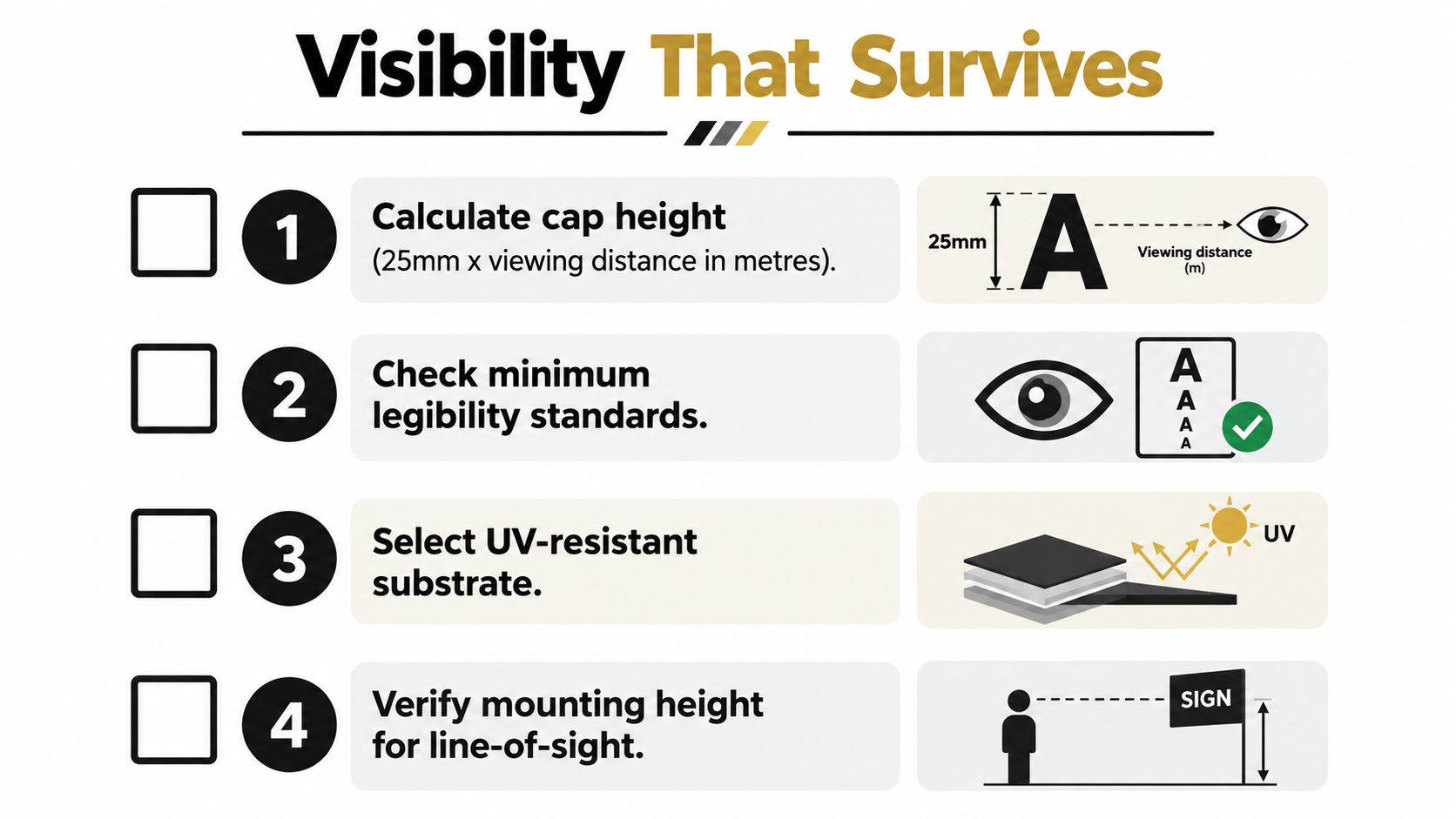
Visibility begins with the approach distance, not the artwork file. A practical rule of thumb is 25 millimetres of capital-letter height for each metre of viewing distance, then the result should be checked against the applicable AS 1319 legibility requirement for the hazard and sign location. Treat the rule as a starting point, not permission to skip a site trial.
Mounting height affects both recognition and damage risk. A sign centre positioned around 1.5 metres to 2.0 metres above the floor often keeps the face within a useful eye-level band while avoiding some vehicle and pallet impacts, but the site layout may require a different solution. A board above a door, beside a guardrail or at a pedestrian crossing needs to be judged from the actual decision point.
Test the conditions people actually see
Walk the route during normal operations. Check the board under the site's working lights, with doors open and closed, forklifts moving and temporary stock in its usual position. A sign opposite a large window may suffer reflection, while a board below high-bay lighting may lose apparent contrast as the light source changes.
Use a matte or anti-glare finish where reflections interfere with the symbol. Don't solve glare by making the sign darker without checking the colour system. The aim is stable figure-ground contrast, not a visually attractive surface.
Laser engraving can lock contrast into the material rather than leaving it as a vulnerable printed layer. On colour-core plastic, the laser exposes the contrasting core. On anodised aluminium, it marks through the anodised surface. These methods remove a common failure point, namely a graphic that peels, rubs away or loses definition as a separate film.
A visibility brief should record:
- Viewing distance: State the furthest point where the message must be understood.
- Line of sight: Check the route perpendicular to the main traffic flow where possible, rather than placing the face parallel to approaching movement.
- Lighting: Note glare, flicker, windows, high bays and low-light conditions.
- Exposure: Tell the producer about UV, chemical wash-down, abrasion and impact.
- Contrast method: Specify whether the design relies on a laser-exposed core, anodised layer or another permanent treatment.
For design support and production-ready sign planning, use the Evright Industrial safety signage design service. The important outcome isn't a board that looks sharp on a workbench. It's a board that remains recognisable at the point where someone has to act.
Mounting and Installation That Keep Signs Legible
A forklift once approached a racking aisle where a mandatory pedestrian-crossing board had been installed behind a duct. The board was present, correctly designed and securely fixed, but the driver couldn't see it until the last moment. Moving it to the first clear sightline on approach solved a visibility problem that no material upgrade could have fixed.
Installation turns a specification into site performance. Before drilling, walk the approach route in both directions and identify the point where a worker or driver first needs the instruction. A sign placed at the end of a hazard zone may satisfy an inventory check while failing the person entering that zone.
Use a repeatable installation check
- Confirm the fixing method: Match the screw, rivet or bracket to the board thickness and the wall or frame behind it.
- Use suitable hardware: Stainless or zinc-plated screws suit wash-down and coastal conditions better than unprotected hardware.
- Prepare aluminium carefully: Pre-drilling helps reduce stress around holes in anodised aluminium.
- Square the face: Position the board close to 90 degrees to the main approach so pictograms don't compress into an oblique reflection.
- Protect the clear zone: Keep at least one sign width clear around all four edges. Don't let pipework, stock or another board shadow the symbol.
- Standardise replacement: Use consistent hole positions and fixing torque so a replacement board can drop into the existing installation.
- Record the result: Photograph the installed board with a tape measure visible. Include the surrounding sightline, not just a close-up.
Installation observation: A clear sign at the wrong decision point is still a failed control.
Where boards form part of a larger visitor or event environment, the same principles apply to screen placement, sightlines and obstruction control. These multimedia signage tips for booths from MediaGun Ltd are a useful comparison for thinking about visibility around competing visual information, even though industrial safety boards need more durable materials and fixed messages.
For construction, infrastructure and site-specific requirements, keep the mounting plan aligned with the Evright Industrial safety signage construction range. Installation photos, location records and a consistent fixing pattern give procurement a defensible replacement trail when the next audit arrives.
Inspection, Cleaning and Replacement Cycles
A safety signage board doesn't remain compliant because it was compliant on delivery. Dust, forklift contact, cleaning chemicals, new pipework and changed traffic routes can all reduce performance. The inspection record should therefore test visibility, accuracy and readability, not just whether a board is still attached.
A practical register can assign more frequent checks to high-traffic signs and quieter checks to general areas. Hazard and prohibition boards in busy routes warrant monthly visual checks. Mandatory and warning boards in general areas can be reviewed quarterly, while the complete signage register should receive an annual condition audit. Those intervals are a risk-based operating method, not a substitute for site-specific judgement.
Give emergency information extra attention
First-aid and emergency-location signage deserves deliberate checking because it may sit in quieter areas and receive less routine cleaning or visual attention. The Australian First Aid Readiness Report found that 43% of workplaces had appropriate first-aid resources, 46% displayed clear and visible signs identifying first-aid resources, and 13% met all core first-aid readiness elements. The St John First Aid Readiness Report shows why a sign's presence alone isn't an adequate readiness test.
At each inspection, ask:
- Visibility: Is the board unobscured and adequately lit from the approach?
- Accuracy: Does the message still match the equipment, hazard or route?
- Readability: Has dirt, fading, glare, scratching or chemical residue reduced contrast?
- Condition: Are there pits, cracks, edge corrosion, loose fixings or lifted corners?
- Context: Have new cabinets, barriers, stock locations or services hidden the message?
| Sign Family | Inspection Interval | Primary Replacement Trigger |
|---|---|---|
| Hazard and prohibition signs in high-traffic zones | Monthly visual check | Obscured face, damaged pictogram, loss of contrast or changed hazard |
| Mandatory and warning signs in general areas | Quarterly check | Fading, contamination, impact damage or changed instruction |
| First-aid and emergency-location signs | Include in frequent route checks and the full register review | Poor discoverability, obstruction, inadequate lighting or changed equipment location |
| Full signage register | Annual condition audit | Any board that no longer matches the site risk, route or physical condition |
Set replacement triggers before a board fails visibly. Contrast loss of roughly 30%, surface pitting, edge corrosion or an illegible pictogram should lead to replacement rather than a cosmetic touch-up. Reorder from the original vector artwork, confirm the current hazard and log the date, location and reason. That register is stronger audit evidence than a box of spare signs with no installation history.
Putting It Together and Getting Boards Produced
A useful quote request gives the producer enough information to make a production decision without guessing. List the sign family, exact wording, pictogram, viewing distance, location, substrate, board dimensions, fixing method, quantity and required delivery date. Add the environmental facts that cause failures, including UV, chemicals, wash-down, abrasion, impact and glare.
The artwork brief should contain vector files, font choices, approved wording, pictograms and colour references aligned with the AS 1319 visual system. Avoid sending a low-resolution screenshot and expecting the engraver to interpret missing details. A clean vector file also makes future replacements consistent.
Ask for production checks, not just a price
Request a sample proof before the full run, particularly when the sign is used in a new environment. Check the legend from the stated viewing distance, inspect the edge finish and confirm that the fixing holes won't weaken the board or cut into critical artwork. If the sign uses colour-core plastic or anodised aluminium, confirm how the laser mark creates contrast and how the selected finish suits cleaning and exposure.
Trotec Laser machinery is well suited to this type of controlled production because it can mark anodised aluminium and laser-markable plastics with repeatable detail. The value isn't the machine name by itself. It comes from matching the laser process, material thickness, artwork and finish so the graphic remains part of the substrate rather than becoming a fragile surface layer.
Evright Industrial, a division of evright.com, supports custom safety signage and asset-labelling work across industrial, healthcare, electrical and infrastructure applications. Its production approach uses durable substrates and Trotec Laser machinery, with the broader evright.com engraving partnership information explaining how the service works across custom engraving requirements.
A strong production handover ends with three files or records: the approved artwork, the material and finish specification, and the installation register. Keep those together. When a board is damaged or an audit identifies a gap, procurement can reorder the correct item instead of restarting the design process.
For Australian operations, Evright Industrial produces laser-engraved safety signage, equipment identification and replacement boards matched to the actual hazard, viewing route and environmental exposure. Visit Evright Industrial to discuss a quote-ready signage specification, durable substrate options and production support for your next site-wide replacement programme.
Recent Comments