
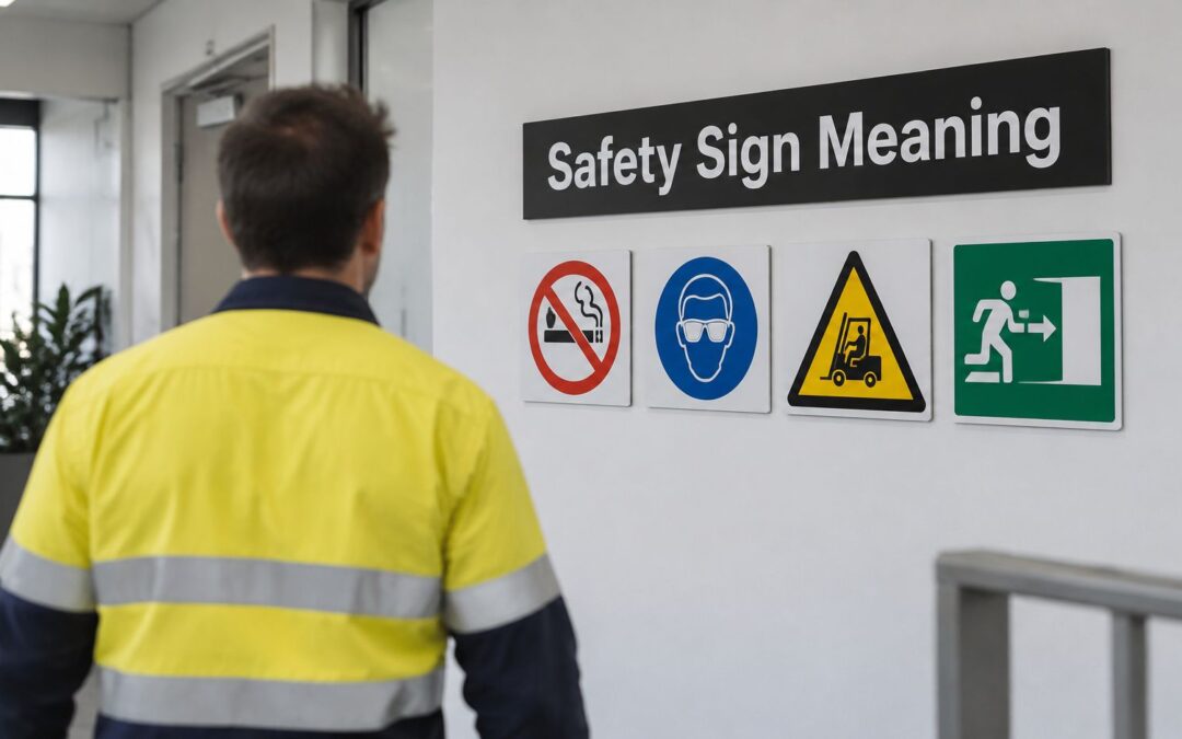
You're standing at a workshop entrance, looking at a cluster of signs: a hard hat, a yellow triangle, a red slash and an arrow towards an exit. Before you step inside, you need to know which signs demand action, which identify hazards and which will help in an emergency.
Understanding safety signage meaning starts with colour and shape, but it doesn't end there. A sign also needs to match the actual hazard, remain readable and reach you before you make the decision to enter, operate or cross.
Safety Sign Colours and Shapes at a Glance
A safety sign is the last line of a control system, the message that reaches a worker when every other defence is already in place. In Australian workplaces, shape and colour identify the type of safety message before you read a word. Read that combination first, then let the symbol and wording tell you the required response.
The categories below follow WorkSafe ACT's safety signage guidance. Red carries several meanings, so colour alone never settles the question.
Australian safety sign categories by colour and shape
| Sign category | Colour and shape | What it tells the worker | Typical example |
|---|---|---|---|
| Prohibition | Red circle with diagonal slash | Action is not permitted | No smoking |
| Mandatory | Blue circle with white pictogram | An instruction must be followed | Wear hard hat |
| Restriction | Red circle without slash | A numerical or defined limit applies | Speed limit sign |
| Danger | White lettering on red oval within black rectangle | Potentially life-threatening hazard | High voltage |
| Warning | Black triangle, generally black pictogram on yellow | Hazard not expected to be life-threatening | Slip hazard |
| Emergency facility | Green with white text or pictogram | Exits, first-aid stations and safety equipment | Emergency exit |
| Fire equipment | Red with white content | Fire alarms and firefighting facilities | Fire extinguisher |
Read the combination, not one feature
Circles do three different jobs: they prohibit, mandate or limit behaviour. A triangle warns. The red oval inside a black rectangle belongs to DANGER headers, and green marks emergency facilities. Red causes the most confusion because it covers both a forbidden action and a fire extinguisher. The shape tells you which.
For example, a blue hard hat sign means the helmet goes on before you enter the designated area. A yellow slip-hazard sign asks you to assess the surface and proceed accordingly; by itself it does not prohibit entry. Workers new to the system often treat a warning as a ban, or a fire sign as a prohibition. Reading the shape first prevents both mistakes.
The signal word sets the severity, so DANGER and WARNING signs are never interchangeable, even when the pictograms look similar.
Why the shared visual language matters
AS 1319 is the Australian standard for safety signs, revised in 1994. Its colour and shape coding gives workers a shared visual language, so a worker arriving from another site can recognise an exit without learning a local design system.
That consistency also gives you a test. If a sign's colour and shape do not match its category, or it sits where nobody can see it before the decision point, the control is broken.
Practical rule: If the colour and shape don't match the sign's category, report it as a defect. That pairing is functional information, and a sign that gets it wrong can misdirect a worker at the exact moment it should guide them.
How to Decode Any Safety Sign in Five Steps
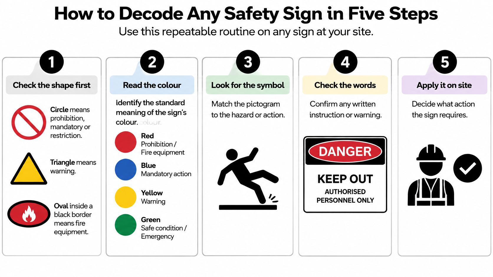
Use this repeatable routine on any sign at your site. The visual guide provides a prompt, but always check the actual sign's complete message.
Start with the visual message
Check the shape first. A circle narrows the message to prohibition, mandatory action or restriction; a triangle indicates warning. A DANGER header uses a red oval within a black rectangle, not a fire-equipment symbol, while a chemical hazard pictogram uses a diamond.
Check the colour against the category. Blue indicates a mandatory instruction, yellow a warning and green an emergency facility. Don't assume every red sign prohibits something, because fire-equipment signs also use red.
Name what the pictogram shows. Is it identifying a hazard, telling you to wear equipment or locating a facility? A boot symbol and a slipping person require different responses, even though both concern your feet.
Confirm the required response
Read the signal word. For occupational hazard signs, DANGER indicates a potentially life-threatening hazard, while WARNING identifies a hazard not expected to be life-threatening. Don't let familiar wording make you overlook the severity or the specific exposure described underneath.
Read the supplementary text and apply it. Look for limits, access conditions, directions and contact information. A familiar symbol doesn't excuse skipping wording that defines exactly where the instruction applies.
A common mistake is reading only the largest word, then walking past the boundary described below it. Another is recognising a PPE symbol but assuming equipment can be collected after entry.
Use the video as a further visual prompt, while checking every example against your site's Australian signage requirements.
Before proceeding, ask: What must I do before I enter this area? A useful sign makes that answer clear.
Why Signs Come After Engineering Controls
Putting up a sign doesn't make an exposed hazard safe. A sign is the label on a locked door, not the lock.
Queensland's 2024 Sugar Mill Safety Code of Practice treats signage as an administrative control and recommends installing signs where AS 1319 requires them. The practical implication is straightforward: eliminate the hazard where possible, then use higher-order controls such as guarding, isolation, ventilation or traffic separation before relying on instructions.
Name the exposure, not just the equipment
Say a conveyor has an accessible rotating shaft. A plate identifying the conveyor helps maintenance staff locate the asset, but it doesn't explain the entanglement risk.
A useful warning identifies that risk and tells the worker to keep hands clear of the rotating shaft. Even then, the warning doesn't justify leaving a required guard absent.
Position the message where someone decides what to do: at the access gate, control panel, chemical-store entrance or vehicle crossing. A warning behind the hazard reaches the worker too late.
Specify for the operating environment
Before ordering, give the fabricator a usable specification:
- Contrast and legibility: Keep the message distinct from its background and surrounding notices.
- Viewing distance: Size symbols and wording for the actual approach, not a close-up proof.
- Mounting height: Check whether doors, stored goods or machinery will obscure the sign.
- Environmental resistance: Account for sunlight, cleaning chemicals, moisture, heat and abrasion.
- Message accuracy: Use appropriate pictograms, clear English wording and metric units where applicable.
Include inspection triggers in the maintenance process. Plant changes can make wording incorrect; repainting can reduce contrast; contamination and impacts can conceal or damage the message.
A sign that can't be seen at the decision point has failed, even if its artwork is correct.
The acceptance check therefore needs to happen on site, not only on a supplier's drawing.
Chemical Hazard Diamonds and Placards
Chemical signs carry information in layers. Don't read a red diamond as a general instruction to keep out, and don't assume a familiar pictogram tells you everything needed to handle the substance.
Read the layers in order
The red diamond identifies a chemical hazard pictogram. Inside it, the black symbol on white identifies the type of hazard, helping you recognise the exposure before reading the detailed label.
The signal word then indicates relative severity. In chemical communication, DANGER means a more severe or significant hazard; WARNING means a less severe hazard. That's a chemical classification distinction, so don't substitute the occupational-sign severity test without reading the chemical label.
Next, read the hazard statement and instructions. Recognising a flame symbol, for example, isn't enough to decide how to transfer, store or clean up the material.
Safe Work Australia's hazardous chemical signs and placards guidance describes the system's nine pictograms and specifies an outer HAZCHEM placard 120 mm high by 600 mm wide, with red lettering 100 mm high on a white or silver background. Those specifications belong in the fabrication brief, not in a designer's discretionary styling choices.
Chemical sign elements and prescribed specifications
| Element | Requirement | Where it applies |
|---|---|---|
| GHS pictogram | Black symbol on white background within a red diamond; nine pictograms in total | Chemical containers and storage signs |
| Signal word DANGER | Indicates a more severe or significant hazard | Labels and hazard signs |
| Signal word WARNING | Indicates a less severe hazard | Labels and hazard signs |
| Sign placement | Next to the hazard and clearly visible on approach | All hazardous chemical locations |
| Outer HAZCHEM placard size | 120 mm high by 600 mm wide | Bulk chemical storage |
| HAZCHEM lettering | Red letters 100 mm high on white or silver background | Bulk chemical storage |
Separate handling information from emergency information
A container label helps the person working with the substance. Bulk-storage placards also help emergency responders identify a chemical location before approaching it. Neither should be obscured by shelving, open doors or parked equipment.
For a broader facilities-management perspective, Facility Management Insights on HazCom compliance offers supplementary reading. Australian requirements should remain the basis of your site specification.
Don't redraw GHS symbols, adjust their proportions or replace their colours with a brand palette. After installation, compare the signs and applicable placards with the chemical inventory and emergency-access arrangements. Confirm that each location displays the information appropriate to what is stored there.
Traffic, Exit and First-Aid Signs on Site
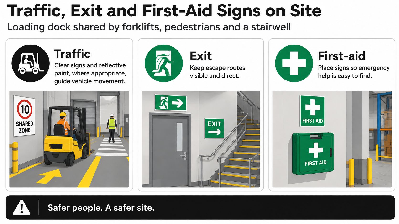
Consider a loading dock where forklifts, pedestrians and a stairwell share an approach. A worker arriving from the yard needs to recognise the vehicle hazard, find the permitted walking route and still locate the exit or first-aid facility without confusion.
Use this visual checklist to review those overlapping needs.
Traffic messages must distinguish hazard from access
Safe Work Australia's traffic management guide recommends clear signs and road markings, including reflective paint where appropriate. These identify exclusion zones, safety zones, parking areas, speed limits, crossings, blind corners, steep gradients and forklift operating areas.
The wording “FORKLIFTS IN USE” identifies a hazard. “PEDESTRIANS PROHIBITED” tells pedestrians they must not enter. They aren't substitutes: a worker who sees only the hazard warning may still need a separate direction to the protected walking route.
Check the approach under normal operating conditions. Drivers moving from bright daylight into a dull dock may struggle to pick out signs, so avoid abrupt lighting changes and maintain markings where traffic and cleaning wear them away.
Keep the escape route identifiable
At the stairwell, the exit sign must lead towards a usable escape route rather than a storage area. WorkSafe Victoria's workplace facilities compliance code says exit routes must be easily seen during an emergency; one acceptable marking method uses permanent contrasting side-border lines at least 50 mm wide, or glowing markers.
White, yellow or another clearly contrasting colour may be used for those lines. Apply the marking method to the actual route, and review emergency exit signage requirements when planning changes.
Make first aid findable
A white cross on green identifies first-aid facilities. WorkSafe Victoria's first-aid compliance code also calls for emergency-service telephone numbers and information that helps workers locate first-aid officers, such as their location or an authorised photograph.
At the dock, that means someone should be able to identify where to obtain help without asking a colleague who may be unavailable.
Finish the walk-through with this checklist:
- Approaches: Each route shows the hazard or access condition before exposure.
- Exit borders: Permanent line markings meet the specified minimum width and remain visible.
- Emergency contacts: Numbers and first-aid officer details are current.
- Layout changes: Remove obsolete floor markings and repaint the correct routes.
What to Do When a Sign Is Missing or Wrong
A colour-and-shape mismatch, incorrect pictogram or missing sign is a defect to investigate. It isn't permission to enter, and it shouldn't be dismissed because regular workers already know the area.
Use a short corrective procedure
Stop and assess the exposure. Confirm the hazard with the supervisor before entering. For a chemical store, check the inventory and relevant chemical information rather than guessing from neighbouring signs.
Record and report the defect. Note the location, sign type and date in the site register. Photograph the approach as well as the sign so the reviewer can understand the visibility problem.
Restore the necessary control. Arrange isolation, guarding or traffic separation where needed. Don't use a temporary notice as permission to continue an activity that lacks an essential protective measure.
Verify the replacement specification. Check the category, wording and pictogram against AS 1319 and applicable chemical or traffic requirements before fabrication.
Check the installed result. Walk towards the location from each normal approach. Confirm the message is readable before the exposure begins, then close out the defect record.
Keep emergency information in the same review, including first-aid locations, contact details and exit-route marking dimensions.
Close-out test: Replacing the sign isn't enough. Confirm that the original communication failure has been corrected.
Use the site's safety non-compliance process to assign responsibility and track completion rather than leaving the issue as an informal request.
Confirm Your Site Signs Meet the Standard
Audit the site before the next inspection, rather than waiting for an inspector to identify a missing message. A sign is the last line of a control system: it has to name the hazard clearly, reach the worker before the decision point, and leave no doubt about the required response. Treat each check as a test of that chain.
Use a clipboard or digital register to capture the location and outcome of each check.
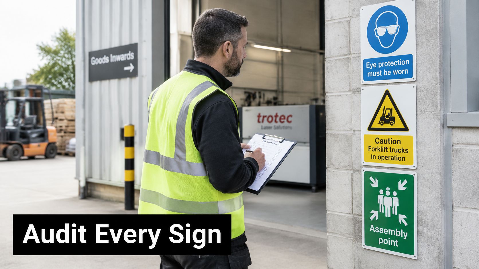
Audit what workers actually encounter
Start where the choice is made: the gate, the isolator, the chemical cabinet, the forklift crossing. A warning that becomes readable only after the gate is open arrives too late, even when the artwork is correct.
- Inventory each sign: Record its category, location and purpose, including equipment labels that carry safety instructions.
- Verify the message: Compare colour, shape, pictogram and wording with the applicable requirements and the current hazard.
- Test visibility: Approach from normal working distances and assess lighting, mounting height and obstructions.
- Log replacements: Record faded, damaged or contaminated signs and document each completed change.
- Trigger another review: Recheck affected areas after plant modifications, repainting or layout changes.
For switchboards and electrical equipment, include the applicable Australian electrical safety standards in the specification review. A durable identification plate and a hazard warning serve different purposes, even when they sit on the same enclosure.
Specify the replacement before fabrication
Define the material, contrast, size, mounting method and approved artwork before production. Don't assume an accurately engraved sign automatically has the correct safety meaning.
Evright Industrial is part of evright.com, with nearly six decades of engraving experience. We produce asset labels, safety signage, steel plaques, panels, switch plates, electrical switchboards, stencils, branding and laser-cut architectural designs, including identifying markers for defence and essential services items.
Laser marking uses a focused beam to change or remove surface material, leaving a permanent engraved mark on suitable materials. It avoids dependence on an applied printed layer that can peel. Permanence alone still does not confirm colour coding, size, wording or placement, so keep those points in the written specification.
Discuss the sign specification with evright.com before fabrication, including how the chosen material and marking process will preserve the required colour coding and legibility.
Evright Industrial offers safety signage and durable equipment identification matched to industrial applications. Visit Evright Industrial with your sign register, site photographs and proposed wording to discuss replacement signs before fabrication.
Recent Comments