

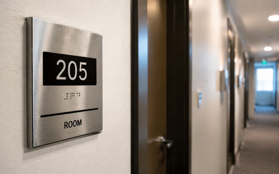
You've probably seen it already, a corridor with too many identical doors, a receptionist pointing people the wrong way, or a technician pausing at the threshold because the room label doesn't tell them enough. In a busy facility, room identification signage is the difference between smooth movement and constant interruption. It has to work for first-time visitors, staff who know the building well, and people who rely on tactile cues, all at the same time.
The reason this matters in Australia is simple, the signage is not just a design choice. The National Construction Code sets precise requirements for tactile room signs, including mounting position, Braille format, and spacing from the architrave, so these signs support safe and consistent wayfinding across public and commercial buildings (NCC Specification D3.6, NCC Braille and tactile signs). That's why good room signage is part navigation tool, part compliance control, and part operational system.
A strong signage program also does something less obvious, it reduces hesitation. When people can find the right room quickly, they make fewer mistakes, ask fewer questions, and move through the building with more confidence. In a large estate, that consistency becomes even more important, which is why structured room naming conventions matter just as much as the sign face itself.
Introduction to Room Identification Signage
A facility can look organised on a plan and still feel confusing on the ground. The problem usually isn't the building, it's the lack of a clear language at the door. When a room label doesn't tell you where you are, whether the sign is tactile, or how the numbering system works, everyone slows down.
That's where room identification signage earns its place. It turns a door, wall, or corridor entry into a readable instruction, one that can be understood quickly by people with different levels of familiarity and different access needs. In Australian buildings, that instruction has to align with the NCC, because tactile room signs are governed down to the millimetre, not left to guesswork (NCC Specification D3.6).
Why the sign at the door matters
A good room sign does more than name a space. It helps a visitor confirm they've reached the right room, gives staff a consistent reference point, and supports compliance in accessible environments. In large institutions, the numbering pattern itself becomes part of the wayfinding system, especially where buildings and levels repeat across an estate.
Practical rule: if the sign doesn't help a person confirm location at a glance or by touch, it's not doing its job.
That is why this topic sits at the intersection of accessibility, operations, and branding. A clear sign improves movement, but a well-structured sign system also protects consistency across departments, clinics, workshops, and public buildings. In the Australian context, the details matter because the standard is specific, and the result is a sign system that works across many kinds of spaces, not just one.
What makes the Australian approach distinctive
Australian room signage is tightly linked to tactile compliance, but it also reflects practical estate management. Large campuses and multi-building environments benefit from a system where room identities are predictable and easy to parse. That's a different challenge from putting a number on a door.
The fundamental point is this. A sign is not a label stuck on at the end. It's part of the building's information architecture, and the better that system is planned, the less friction the building creates for everyone using it.
Purpose and Benefits of Room Identification Signage
Clear room signage pays off in three places at once, wayfinding, safety, and compliance. That's why it shows up in hospitals, factories, schools, and government buildings, even though each setting uses it differently. A visitor who can locate a clinic room without asking for help has a better experience, and a technician who can find the correct plant room without delay wastes less time and creates fewer handover errors.
In industrial spaces, room labels help separate similar-looking areas that serve very different purposes. A control room, a battery room, and a maintenance store might sit close together, but the sign on each entry has to make the distinction obvious. In a healthcare environment, the same principle supports calm movement, especially where patients or visitors are already under stress.
Safety and compliance are built into the sign
Australian compliance requirements make this more than a matter of convenience. The NCC requires tactile room signs to be mounted on the latch side of the door, with a specified leading-edge offset and a defined height band for the tactile elements (NCC Braille and tactile signs). That means the sign has to be discoverable, not just visible.
Room signs also support sector-specific safety needs. In Queensland, a laser procedure room must have a visible warning luminaire at every entrance, and the door sign must carry the hazard symbol plus exact warning wording about not entering when the light is illuminated and wearing eye protection (Queensland Health non-ionising radiation apparatus guidance). In Tasmania, rooms where laser or IPL equipment is used need warning signs at all entrances, with temporary signage for mobile equipment (Tasmanian laser and IPL compliance guidance).
The operational return is practical, not abstract
A well-planned signage system reduces repeated directions, wrong turns, and avoidable interruptions. It also makes maintenance easier, because a standard format is simpler to inspect and replace. If one building uses a different naming pattern from the rest, staff spend more time decoding the system than using it.
Consistency matters more than decoration. If people can't predict where a sign will be or how a room is named, the sign system starts creating work instead of removing it.
Brand consistency matters too, but only after function is secured. A clean visual style helps a building feel organised, yet the first job of room identification signage is still to guide people accurately and legally.
Common Types of Room Identification Signage
Room identification signage isn't one product. It's a family of formats, each suited to a different viewing distance and use case. A small plaque at the latch side of a door serves a different purpose from a large overhead sign that can be read from across a corridor, and a digital display solves a problem that a fixed plate can't.
The best systems usually combine more than one format. Australian guidance for large estates often uses a fixed door sign plus a variable layer above the entry, so the room can be identified up close and also recognised from further away (NSW signage technical standard). That layered approach is practical because people don't move through buildings at one distance only.

Matching format to environment
Door-mounted plaques work best where the goal is precise identification at the point of entry. Offices, clinics, and treatment rooms often use this style because the reader is already standing beside the door.
Wall-mounted panels suit larger identification needs, especially where departments, suites, or multiple rooms need to be grouped under one visual system. These are useful in schools, administration buildings, and industrial facilities that need a broader information surface.
Overhead wayfinding signs help people orient themselves before they reach the door. They're most valuable in large public spaces where traffic flow matters and signs need to be seen from a distance.
Digital displays are best when the room information changes often. Meeting rooms, seminar spaces, and education spaces benefit from this flexibility because the display can carry live room status or booking details.
Naming convention is part of the type selection
Western Sydney University's signage standard uses a clear numbering pattern, building number or alpha character first, then level, then room number, separated by periods (Western Sydney University signage standard). That structure matters because even a well-made plaque can confuse users if the naming logic is inconsistent.
Design insight: the best room sign is the one people can interpret in one glance, then confirm by touch if needed.
For deeper material choices and engraving options, the practical fit often depends on whether the sign is meant to be permanent, changeable, or both. A useful reference point is this overview of laser engraved acrylic signs, which shows how a simple format can still deliver crisp room-level identification.
Design and Accessibility Requirements
Australian room signage has to do two jobs at once, communicate visually and remain usable by touch. That makes the design rules stricter than many people expect. If the sign looks good but isn't mounted correctly, or the tactile content isn't formatted properly, it doesn't meet the standard.
Start with tactile structure
The NCC requires Grade 1 Braille, raised and domed, placed 8 mm below the bottom line of text (NCC Braille and tactile signs). It also requires the tactile elements to sit between 1200 mm and 1600 mm above the floor, with the leading edge 50 mm to 300 mm from the architrave. Those measurements matter because they determine whether the sign can be found and read at the doorway.
The latch-side location is just as important. A sign positioned on the hinge side defeats the logic of discovery, because the user is meant to find the sign before stepping through or opening the door. In practice, the sign should be reachable, consistent, and free from anything that blocks the approach.
Keep the visual layer easy to read
Contrast, finish, and legibility still matter for sighted users, even when Braille is present. A sign should be easy to parse from a sensible standing distance, with clean letterforms and enough visual separation between text and background. Non-glare finishes are often safer in busy corridors because reflections can make room numbers hard to read.
For teams that need a practical benchmark, a strong safety-sign programme is a useful companion reference, especially when planning mount points and visibility in shared environments. GM GROUP Services' safety sign insights are helpful because they reinforce the same basic idea, signs work best when they're seen, understood, and placed where people naturally look.
Use a compliance checklist before fabrication
A room sign should be checked in this order:
- Text content first, confirm the room name or number is final.
- Tactile content second, verify Braille and raised text are aligned to the approved wording.
- Mounting position third, confirm latch-side location and height band.
- Visibility last, check contrast, glare, and any obstruction from trim or door furniture.
A good compliance review catches the sign before it leaves production. Fixing the artwork is easier than fixing a mounted sign.
For industrial settings, the lesson is straightforward. Don't treat tactile signs as decorative plaques with extra dots. Treat them as access devices with precise placement rules and a defined reading order.
Materials and Engraving Methods for Durability
Material choice controls how long a sign stays legible, how well it handles cleaning, and how much wear it can take before replacement. In hard-use spaces, the sign isn't just displaying information, it's surviving friction, touch, and repeated maintenance. That's why the substrate and the engraving method need to match the environment.
Compare the common substrates
Stainless steel suits demanding locations where toughness and a clean finish matter. It resists abrasion well and has a professional look, which makes it a strong option for industrial and service areas.
Anodised aluminium offers a lightweight, durable option with a neat appearance. It's a practical choice when you need a stable sign face that can handle regular cleaning without looking fragile.
High-impact acrylic is useful where a crisp visual finish is important. It can be fabricated into clean forms and suits room signs that need to look precise while staying cost-conscious.
Photopolymer plates are often chosen for detailed tactile work because they support raised characters and Braille formation cleanly. The finish can be adapted to suit a range of visual styles while still supporting the tactile requirements discussed earlier.
Match the method to the material
Laser engraving is a strong fit for detailed room identification because it produces sharp edges and consistent repeatability. That matters when a building has many signs that need to look identical from one door to the next. Trotec Laser equipment is commonly associated with this kind of precision work, especially when the sign system needs clean marking across acrylic, metal, and layered substrates.
CNC routing is better suited to thicker formats or shapes that need more substantial cutting. Photopolymer casting has its own place where tactile depth and repeatability are priorities. The right choice depends on the location, cleaning regime, and desired finish.
For organisations looking for a practical production model, stainless steel signs are a good reference point because they show how durability and a clean aesthetic can work together without compromising readability.
Sustainability is part of the material decision
Energy-efficient laser processes can reduce waste by cutting only what's needed and minimising offcuts. That matters in large signage runs where repeatability and material efficiency both influence the project footprint. A leaner fabrication method also helps when rooms change over time and replacement signs need to match the original set.
Material rule: choose the substrate for the environment first, then choose the engraving method that preserves clarity, not the other way around.
The best outcome is a sign that still looks deliberate after cleaning, handling, and years of service. That's the standard worth aiming for.
Installation Best Practices Across Sectors
Installation is where good signage can still fail. A perfectly made room plate can become hard to find if it's mounted on the wrong side, hidden by a door swing, or placed at an inconsistent height. Good installers treat placement as part of the design, not as a final afterthought.

Confirm the doorway before fixing anything
Start by checking which side of the door is the latch side and whether the wall mount is possible. The NCC allows door-mounted placement only where wall mounting isn't possible, so the first decision is the mounting surface, not the graphic layout (NCC Specification D3.6). This step avoids the common mistake of installing a sign where it's visible from the corridor but not practically discoverable at the entry.
Then check the clearance around the architrave and trim. The sign's leading edge needs to remain within the specified offset band, which means measurements should be taken before drilling or adhesive application. In multi-door corridors, it's worth marking each doorway in sequence so the final height and offset stay consistent from room to room.
Use layered signage where the building needs it
Australian guidance for large estates often pairs a fixed room sign with a variable layer above the entry to improve long-range visibility (NSW signage technical standard). That combination helps in busy corridors where people need to spot the room from afar, then confirm the exact room at the threshold.
This is especially useful in public buildings where crowding can block a low-mounted plaque. A higher visual layer gives the eye a second chance to catch the room identifier without replacing the tactile sign at the door.
Sector-specific placement details matter
Queensland laser procedure rooms need a visible warning luminaire at every entrance, plus the required warning text and hazard symbol on the door sign (Queensland Health guidance). Tasmania's compliance guidance adds that all entrances to laser or IPL rooms need warning signs, including temporary signs for mobile equipment (Tasmanian guidance).
For teams coordinating access hardware as part of the doorway, Specialist door entry technology can be useful context because the door environment often shapes sign placement, sightlines, and user approach. The sign should work with the door system, not fight it.
For workplace and industrial sites, workplace safety signage is a useful adjacent category because the same visibility discipline applies across entrances, corridors, and controlled areas.
If a person has to twist, stop, or step past the door to find the sign, the installation needs revisiting.
The best installations feel invisible because they reduce effort. People find the room, confirm the name, and keep moving.
Maintenance and Lifecycle Guidance
A room sign is only reliable if it stays readable and properly fixed. UV exposure, cleaning chemicals, and surface wear all shorten the useful life of a sign, especially in buildings that get frequent traffic. If the information fades or the tactile elements flatten, the sign stops doing its job.
Inspect the sign like a safety device
High-risk rooms need regular checks, not casual glances. In Queensland, laser procedure rooms must include a visible warning luminaire and the specific hazard wording, which makes routine inspection essential for keeping the sign system functional (Queensland Health guidance). A lamp that's out or a sign face that's damaged changes the room's safety status.
Cleaning should match the substrate. Acrylic tolerates different handling than metal, and tactile surfaces need care so the raised elements remain distinct. Harsh abrasives are a poor fit for any sign that depends on touch or fine lettering.
Treat replacement as planned maintenance
A sign doesn't fail all at once. The first signs of trouble are usually small, like edge lift, light scratching, dull contrast, or Braille wear. Once those appear, the room label becomes harder to trust, which is exactly when replacement should be scheduled rather than delayed.
A lifecycle plan should cover inspection, cleaning, re-engraving, and disposal. That plan also supports sustainability, because responsible material selection and timely replacement reduce the need for ad hoc rework and wasted stock.
Lifecycle rule: the cheapest sign is not the one you buy first, it's the one that stays legible longest with the least rework.
When signage is treated as a managed asset, it stays compliant longer and costs less to keep in circulation. That's a much better outcome than waiting for visible failure.
Procurement and Installation Checklist
Good procurement starts with a room list that people trust. The room list should be final before artwork is approved, because changing room names after production creates avoidable waste and delays. Once the naming convention is locked, the rest of the job becomes much easier to control.
Build the job in the right order
-
Define the room list and naming convention. Confirm every room that needs identification and standardise the naming pattern before design begins. In large estates, the building, level, and room logic should stay consistent so users can decode the sign quickly.
-
Check compliance against the NCC. Confirm tactile mounting height, latch-side placement, Braille format, and the architrave offset before any sign is released to production (NCC Braille and tactile signs).
-
Select the material and engraving method. Match the substrate to the environment, then choose the fabrication method that preserves readability and durability. Laser engraving is often the best fit when repeatability and crisp edges matter.
-
Coordinate production and installation. Confirm who is responsible for delivery, surface prep, fixing, and final sign-off. The installer should know whether the sign is wall-mounted, door-mounted, or part of a layered system above the entry.
-
Verify tactile and visual accuracy on site. Check height, offset, orientation, legibility, and any obstruction from hardware or furniture before closing the job.
-
Log maintenance details. Record the material, location, installation date, and inspection notes so future replacements are easier to manage.
Use a sign-off process, not guesswork
A good checklist prevents expensive rework because it catches inconsistencies before the sign is fixed to the wall. The visual content, tactile content, and installation position all need approval from the people responsible for access and facilities. That's especially important where room signs are part of a broader compliance system, not just interior branding.

For teams comparing options or preparing specifications, the clearest path is to define the room schedule, confirm the compliance details, and choose a fabrication partner that can handle precise engraving and repeatable production. Visit Evright Industrial to discuss a room identification signage program that's built around Australian compliance, durable materials, and efficient production from first proof to final install.
Recent Comments