
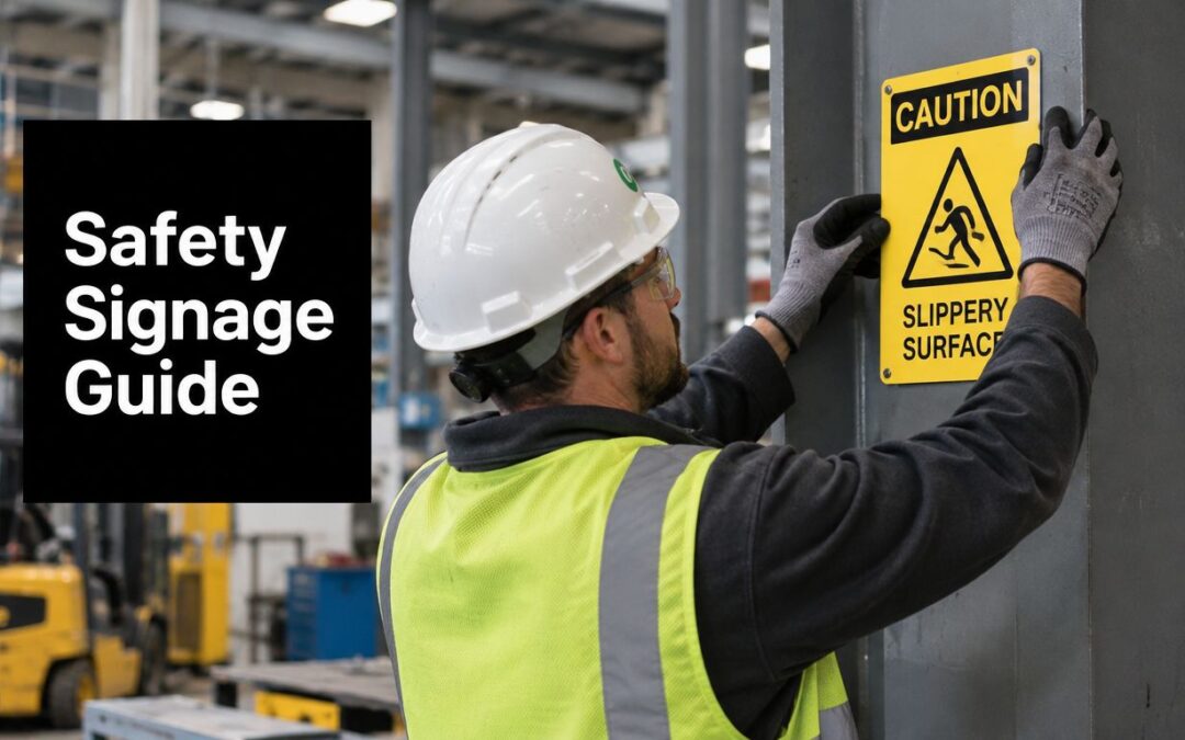
A faded warning sign above a noisy production line rarely fails all at once. First, the colour loses strength. Then a pictogram becomes difficult to distinguish from nearby instructions. Eventually, a worker approaches a hazard without receiving a clear message at the point where it matters. That's why safety signage design must combine visual compliance with materials and production methods that withstand the workplace itself.
In Australian workplaces, the design framework is anchored by AS 1319-1994, while the sign's service life depends on choices such as substrate, engraving depth, contrast, mounting and exposure. A sign that looks correct on the day of installation but fades, scratches or peels has stopped performing its safety function.
Why Safety Signage Design Matters Beyond Compliance
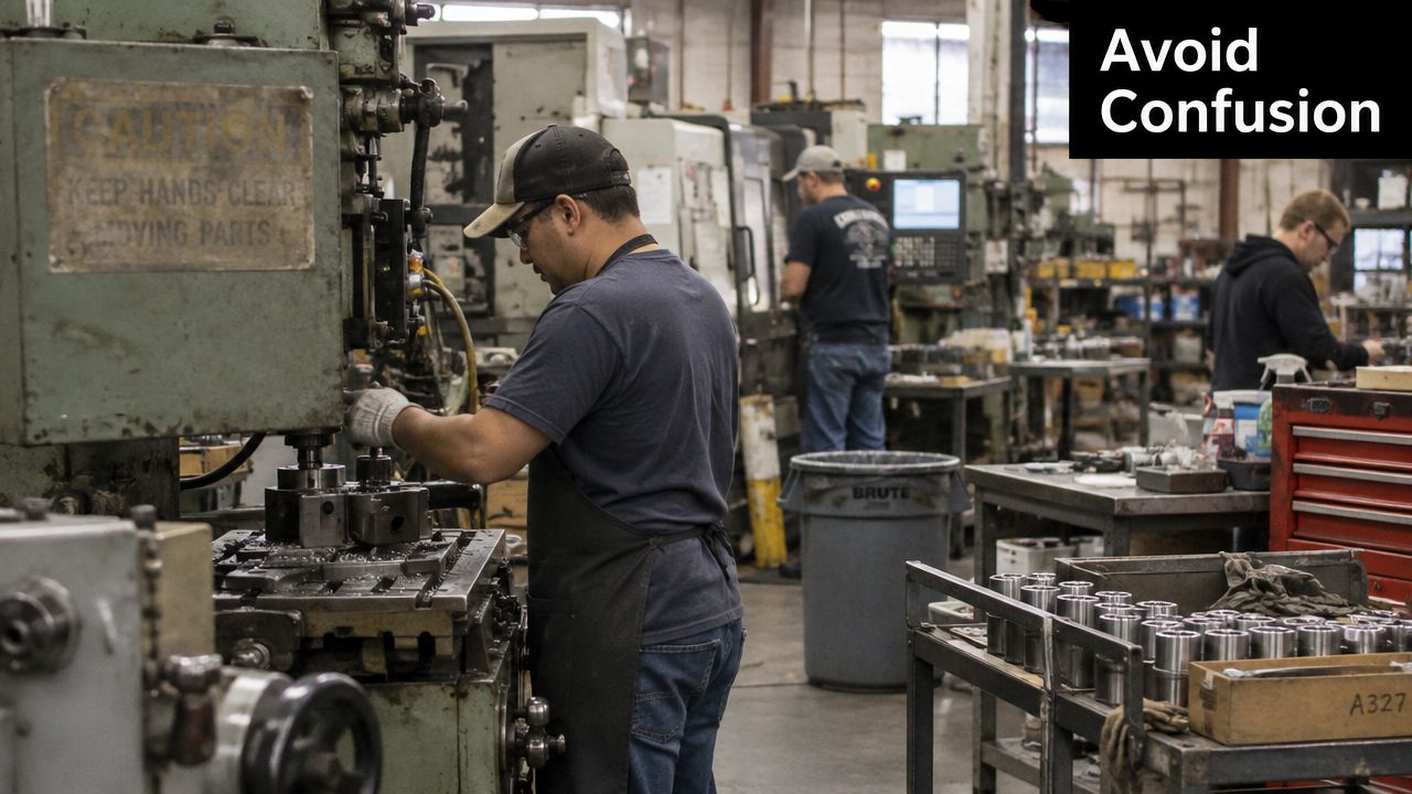
A maintenance supervisor walks through a factory and notices three signs near a machine cell. One is faded by light from the loading-bay doors. Another is partly hidden behind stored stock. The third uses a symbol that resembles a mandatory instruction, although the message is intended as a warning. Staff know the area, so they work around the problem. Visitors, contractors and newly assigned workers don't have that background knowledge.
That distinction matters. Safety signs aren't decoration and they aren't merely audit paperwork. They're a communication system used when people are moving, wearing protective equipment, dealing with noise or responding to an unfamiliar condition. If the sign's colour, shape, symbol or position creates hesitation, the design has failed before anyone reaches for a replacement.
Design errors become operational risks
Poor safety signage design commonly shows up as:
- Visual confusion: Similar pictograms or inconsistent colours force workers to read text instead of recognising meaning quickly.
- Reduced visibility: Glare, dust, faded ink and crowded backgrounds make a technically correct sign difficult to see.
- Wrong response: A warning can be mistaken for a mandatory instruction, or an emergency location can disappear into general workplace notices.
- Weak audit evidence: A sign may exist, yet still fail to demonstrate that the hazard is being communicated effectively.
Human factors deserve attention too. Text shouldn't carry the entire message, especially where workers speak different first languages or where lighting and viewing angles change during a shift. Strong contrast, recognised symbols, adequate sizing and consistent placement help people interpret the sign without stopping to decode it.
The same principle applies to related communication systems. For example, businesses reviewing surveillance notices may benefit from guidance on CCTV signage for businesses, particularly when several types of visitor and compliance information share the same entrance area. The practical lesson is simple: every sign competes for attention, so each one needs a clear purpose, a deliberate visual hierarchy and a surface that stays legible.
Understanding Australian Safety Sign Categories and Colours
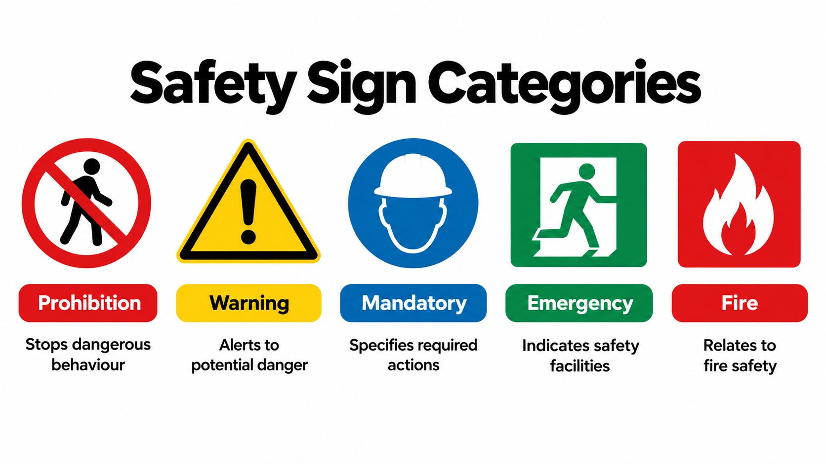
AS 1319-1994 gives Australian workplaces a consistent visual language. It organises safety signage into five core categories, with colour and shape helping workers identify the intended response before they read the full message. Select the category from the hazard or instruction first, then build the sign around that meaning.
The five core categories
- Danger: Use red and white for an immediate serious threat requiring urgent attention. Keep the message direct and place the sign where a person can act before entering the danger area.
- Warning: Use yellow and black to identify a potential hazard. The sign should tell people what condition they're approaching, such as moving equipment, a hot surface or a fall risk.
- Mandatory: Use blue and white when a specific action is required. PPE instructions belong here, but the pictogram and wording must describe the behaviour expected at that location.
- Prohibition: Use red and white, with the recognised prohibition format, to show that an action isn't allowed. Don't use a general warning format when the required response is “do not”.
- Emergency: Use green and white for emergency or safe-condition information, including first aid and safety facilities. EXIT signs are governed elsewhere, so confirm the applicable building and fire requirements for those installations.
Fire and Hazchem or dangerous-goods signs also appear in Australian guidance, each with a distinct operational purpose. Treat those applications as part of the facility's wider hazard communication system rather than forcing every message into a generic warning template.
Practical rule: Don't choose a colour because it matches the facility's branding. Choose it because it communicates the hazard category consistently.
Colour accuracy becomes especially important when signs are repeated across a site. A yellow sign used for one type of hazard in a workshop and a different meaning in a warehouse weakens recognition. The Australian safety-zone sign range provides a useful reference point when standardising the visual treatment of controlled areas.
Sizing Signage for Optimal Legibility and Viewing Distance
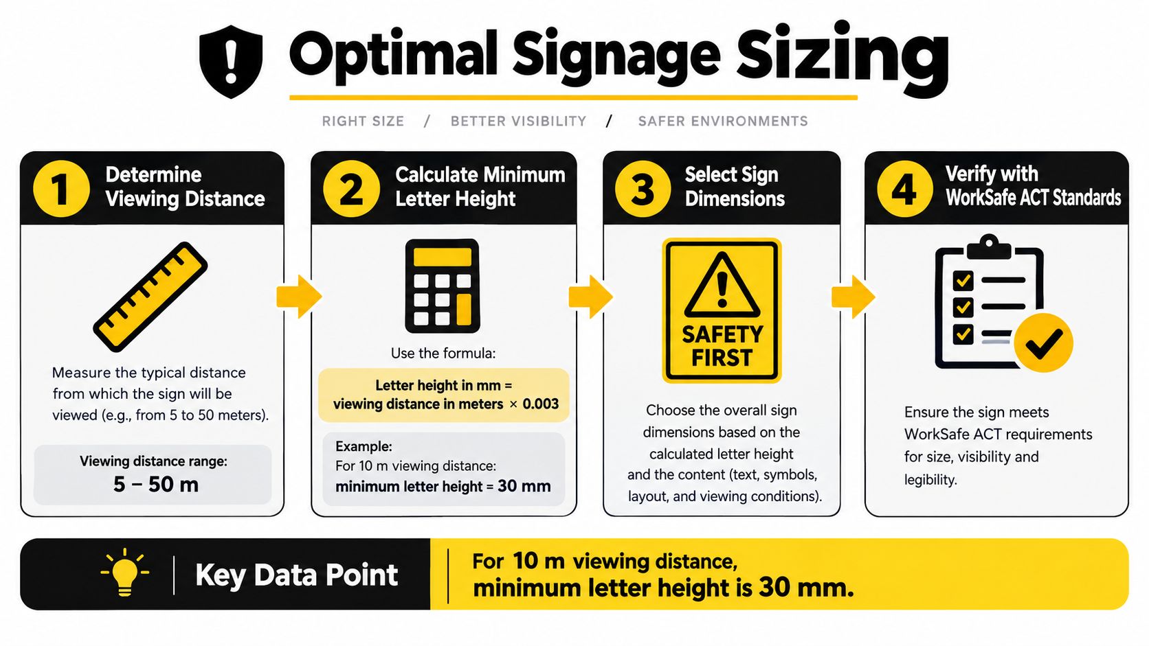
A sign's dimensions should follow the distance from which someone must understand it, not the size that happens to fit a stock order. WorkSafe ACT guidance cites minimum legibility rules of 15 mm pictogram height per metre of viewing distance and 5 mm uppercase text per metre. In poor lighting conditions, the guidance says to increase all sizing by 50%. See the WorkSafe ACT signage guidance when confirming a site-specific design.
Apply the viewing-distance rule
Start by identifying the furthest point where a worker needs to recognise the sign. For a 10 m viewing distance, the minimum pictogram height is 150 mm, and the minimum uppercase text height is 50 mm, based on the WorkSafe ACT ratios. A sign positioned in a dim plant room or outside the direct line of sight needs the poor-lighting adjustment, along with a practical review of contrast and placement.
The calculation is only the beginning. A long instruction needs more space than a short prohibition message, and a sign carrying several symbols can become cramped even when its letters meet the minimum. Build the layout around the primary action, then remove wording that doesn't help a person decide what to do.
Check the whole viewing environment
- Approach distance: Measure from the point where the decision is made, not only from the hazard itself.
- Lighting: Account for shadows, glare and low-light conditions before approving the final dimensions.
- Line of sight: Increase prominence where racking, vehicles, doors or equipment can interrupt the view.
- Ageing: Allow for the fact that fading and surface wear reduce contrast over time.
Typography also needs discipline. Use a clear typeface, generous spacing and a strong contrast between characters and background. For a useful primer on hierarchy and readability, see this font size guide for designers, then apply the Australian viewing-distance rules rather than relying on screen-based design conventions.
Emergency routes deserve particular care because people may read signs while moving quickly or under stress. Review emergency exit signage requirements alongside the relevant building and fire obligations before production.
Choosing Materials That Last in Demanding Environments
A compliant graphic printed onto an unsuitable surface is a short-term fix. The right material depends on what the sign will face every day, including ultraviolet exposure, moisture, abrasion, cleaning chemicals, solvents, heat and impact from nearby activity.
Aluminium is often a practical choice for industrial and outdoor applications because it provides a rigid base and can be specified for demanding locations. Polycarbonate suits situations where impact resistance matters. Acrylic can provide a clean, rigid presentation in protected areas, while vinyl works well for selected smooth surfaces and temporary or changeable applications. None of these materials is universally correct, so the environment should lead the decision.
Match the substrate to the exposure
For a wet washdown area, specify a waterproof substrate and mounting method that won't allow moisture to collect behind the sign. In a chemical store, check solvent compatibility rather than assuming that a surface coating will resist every product used nearby. In a pedestrian route, prioritise abrasion and impact resistance, especially where trolleys, tools or cleaning equipment can contact the face.
Outdoor installations add sunlight, rain and temperature changes to the assessment. Indoor signs may still face harsh conditions in workshops, loading bays and medical areas where frequent cleaning is part of normal operations. Ask the supplier for material data relevant to the actual exposure, not a broad statement that the product is “industrial”.
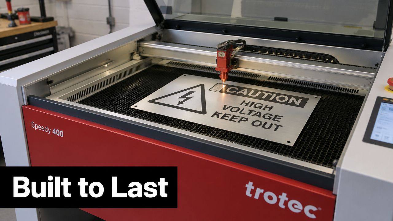
Printed graphics can scratch, fade or peel when the surface and process aren't suited to the location. Laser engraving removes or alters material precisely, creating a mark with durable contrast that doesn't rely on a loose printed film remaining intact. That makes it particularly useful for equipment identification, fixed hazard notices and signs that must remain readable through cleaning and routine contact.
The sensible comparison is lifecycle performance. A lower purchase price has little value if the sign needs early replacement, leaves adhesive residue or becomes visually ambiguous before the next inspection. Select the substrate and marking method together, then confirm that the final colour, symbol and finish still match the approved safety signage design.
Laser Engraving for Durable Compliant Safety Signage
Laser production closes the gap between a compliant artwork file and a sign that continues to communicate after installation. A Trotec Laser machine can cut substrates accurately and engrave fine alphanumeric characters, borders and pictograms with consistent positioning. That precision is useful when a site needs repeated signs that share the same category, proportions and visual hierarchy.
The process also supports layered material construction. A two-layer engraved plastic can expose a contrasting core, giving text and symbols a defined appearance without depending on a printed surface coating. Metal marking and other compatible processes can provide a permanent identification solution where abrasion, handling or cleaning would damage ordinary labels.
Design for production, not just the screen
A good artwork review checks more than spelling. Confirm the following before sending a file to production:
- Category: The hazard has been assigned to the correct AS 1319 category.
- Contrast: The substrate and engraving finish preserve the required colour relationship.
- Geometry: Circles, diagonal bars, triangles and rectangles remain clean at the intended size.
- Text: The viewing-distance calculation has been applied to the actual uppercase or lowercase lettering.
- Repeatability: Site-specific wording doesn't distort the standardised visual elements.
Trotec laser machines are also valuable when a facility needs variations of a controlled design, such as different equipment identifiers, room names or local instructions. Customisation shouldn't mean redesigning the safety language from scratch. Keep the recognised category, colour, shape and pictogram stable, then change only the information that genuinely differs between locations.
Evright Industrial works with laser engraving and asset labelling for equipment identification and safety signage, using precision machinery and durable materials for industrial, healthcare, essential-services and infrastructure applications. Its laser-engraved plastic signs show how a production specification can be shaped around both the visual requirement and the physical environment.
The trade-off is straightforward. Printing may suit a temporary notice or a protected application, while laser engraving makes more sense where permanence, clean detail and repeatable output justify a more durable specification. In every case, approve the visual design first, then test the proposed material and marking process against the conditions at the installation point.
Placement and Installation Best Practices for Maximum Visibility
Even a correctly sized sign can be ineffective if it appears after the decision point, sits behind equipment or competes with a wall full of unrelated notices. Place signs where workers naturally look before they enter a hazard zone, use equipment or choose a route.
Start with a site walk rather than a drawing-board assumption. Stand at the approach point, check the sign from normal working angles and look for obstructions caused by doors, racking, vehicles, pipes or protective screens. High-mounted signs may work across an open floor, but they need sufficient size and lighting to remain visible from below.
Use an installation checklist
- Decision point: Position the message before the person must act, not beside the hazard where it may be too late.
- Viewing angle: Check direct sightlines from pedestrian and vehicle approaches.
- Spacing: Separate signs with different responses so workers don't merge them into one confusing block.
- Lighting: Prevent glare and deep shadow, and provide suitable illumination where the environment requires it.
- Fixing method: Match fasteners, adhesives or brackets to the substrate, surface condition and exposure.
- Curved surfaces: Use a format and fixing system that keeps the face readable without distortion.
- Inspection access: Make it possible to clean, inspect and replace the sign without creating a new access risk.
Maintenance starts at installation. Record the sign's location, material, category and any environmental assumptions, then inspect for fading, scratches, lifting edges, impact damage and changes to the surrounding layout. Replace a sign when its colour, contrast, symbol or attachment no longer supports recognition, rather than waiting for complete failure.
Inclusive design also extends beyond hazard categories. Facilities that serve visitors, patients, contractors or diverse workforces can review principles of inclusive signage for venues to improve navigation, contrast and access without weakening the specific visual rules required for workplace safety signs.
Building a Long-Lasting Safety Signage Program
A signage program needs an owner, a record and a review trigger. Without those three things, signs become fragmented as departments order replacements independently, layouts change and old colours or pictograms remain in circulation.
Create a register that records each sign's location, category, wording, material, fixing method and inspection status. Keep an approved artwork set so replacement signs match the originals. During inspections, assess visibility from the approach direction, surface condition, illumination, obstructions and whether the hazard or required behaviour has changed.
Keep the system current
Review signage when:
- The layout changes: New machinery, partitions, storage areas or traffic routes can create new decision points.
- The hazard changes: Altered processes, chemicals or equipment may require a different category or message.
- The sign deteriorates: Fading, abrasion, peeling and impact damage reduce trust and recognition.
- The standard is reviewed: Check current Australian guidance rather than assuming an old design remains suitable.
- Work practices change: New contractors, visitors or PPE requirements may expose gaps in communication.
AS 1319 has remained a stable foundation for Australian workplace safety signage, with the 1994 edition later reconfirmed as valid in 2018, as summarised in the history of safety signs. That stability supports consistency, but it doesn't remove the need for competent site assessment. A stable standard still needs accurate colour, legible sizing, suitable materials and sensible placement.
Quality signage reduces the risk of a communication gap becoming an operational problem. It also gives maintenance and safety teams a defensible, organised way to demonstrate that hazards are identified and communicated. Evright Industrial can help turn that system into repeatable signs and durable engraved labels, with specifications aligned to the facility rather than a generic catalogue.
Evright Industrial produces custom safety signage and laser-engraved asset labels using Trotec Laser machinery, durable substrates and precision artwork suited to Australian industrial, healthcare and essential-service environments. Review your hazard categories, viewing distances and exposure conditions, then visit Evright Industrial to discuss a signage specification that stays legible and securely installed over its working life.
Recent Comments