
You're usually not looking for a custom safety sign because everything is simple. You're looking because the standard sign on the shelf doesn't quite fit the specific hazard on your site.
A plant room has a site-specific isolation sequence. A warehouse has a blind corner where forklifts and pedestrians cross. A healthcare facility needs clear instructions around restricted access and equipment handling, but the wording also has to make sense to contractors, visitors, and staff moving fast. That's where most signage projects go wrong. Teams customise too much, or they customise the wrong part of the sign.
Good signage solves a communication problem. Compliant signage solves it without creating a legal one.
Why Custom Workplace Signage Needs a Plan
A facilities manager usually starts with a reasonable question. “Can't we just make a sign that says exactly what we need?” Sometimes yes. Sometimes that's the fastest way to create a non-compliant sign that looks neat in the proof and causes trouble during an audit or after an incident.
Signs sit low on the hierarchy of controls compared with elimination, substitution, or engineering controls, but they still matter. They direct behaviour at the point where a worker makes a decision. Enter or don't enter. Wear PPE or stop. Isolate before service. Use this exit, not that one.
The problem is that “custom” often gets treated like unlimited creative freedom. It isn't. The practical job is to customise the hazard message while keeping the visual language workers already recognise.
Where projects usually drift off course
I see the same pattern often. A team identifies a genuine site hazard, then starts changing colours, swapping symbols, stretching layouts, or adding too much text because they want the sign to “say everything”. The result can be harder to read, slower to process, and less consistent with the rest of the site.
That's especially risky on mixed environments where employees, contractors, and visitors all share the same spaces. Construction sites show this clearly. If you need a field-focused companion resource, this guide for construction site safety management is useful because it frames signage as part of broader site control, not as a standalone purchase.
Practical rule: If the sign has to do all the safety work by itself, the control measure is already under pressure.
Start with the hazard, not the artwork
Before anyone opens a design tool or requests a quote, pin down three things:
- The actual hazard: What exactly are people exposed to at that location?
- The required action: Stop, warn, wear, isolate, keep out, or locate emergency equipment?
- The audience: Staff only, contractors, the public, patients, drivers, or a mix?
That simple discipline changes the quality of the project. It stops the sign from becoming a catch-all noticeboard and keeps the final result aligned with how safety communication works in practice.
Decoding Australian Safety Sign Standards
A custom sign stops helping the moment it looks unfamiliar to the people who need to react to it. Australian safety signage relies on AS 1319 so workers can recognise the sign class before they read every word, with standardised rules for colour, shape, and general presentation (AS 1319 sizing and colour guidance).

That is the compliance risk many custom projects miss. The wording may be site-specific, but the sign still has to behave like a standard safety sign at a glance. Once colours, symbols, or layouts drift too far, recognition slows down and compliance questions start.
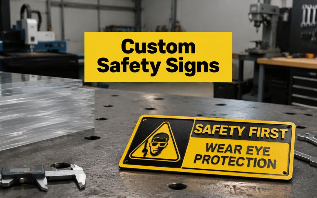
The five sign classes workers already recognise
AS 1319 groups workplace safety signs into five broad classes. Each class uses a familiar visual format, and those conventions do real work on busy sites.
| Sign class | Typical visual form | What it communicates |
|---|---|---|
| Prohibition | Red circle with slash | Actions or access that are not allowed |
| Warning | Yellow triangle | Hazards or dangerous conditions |
| Mandatory | Blue circle | Actions that must be carried out |
| Emergency information | Green rectangle | Exits, first aid, and safety equipment |
| Fire safety | Red rectangle | Fire fighting equipment and related information |
The class needs to stay intact even when the message is customised. A confined space entry sign, for example, may need site-specific wording, permit references, or PPE instructions. It should still present those instructions within the correct class structure, rather than turning into a generic notice with mixed colours and competing messages.
Colour use matters for the same reason. Red is associated with danger, fire equipment, and emergency stop functions. Yellow signals caution. Green identifies first aid and emergency information. Blue marks mandatory actions. If a custom sign swaps those cues around because the design tool allows it, the result may look tidy in a proof and still perform poorly in the field.
Size is part of compliance
I regularly see buyers focus on panel size after they have picked a wall. The better sequence is to start with the viewing distance, the approach path, and the point where a person has to make a decision.
The AS 1319 sizing guidance linked above gives a useful reference point. A danger sign sized at 300 x 225 mm suits shorter viewing distances, while larger formats are needed as the sign has to be read further out. The same guidance also notes that pictograms need to scale with viewing distance. In practice, that matters more than clever wording. If the symbol and header cannot be recognised early, the sign is already underperforming.
Three checks help avoid the usual sizing mistakes:
- Measure from the decision point. Use the distance where the worker, driver, or contractor needs to act, not the distance from the sign face.
- Allow for the approach angle. A sign viewed from a corridor bend, a loading dock entry, or a forklift path often needs more prominence than one viewed head-on.
- Prioritise recognition. The sign class, signal word, and symbol should register before the reader gets into the detail.
Over-customisation is a common source of trouble. Teams add extra lines, multiple symbols, site rules, and contact details to one panel, then reduce font size to make everything fit. The sign remains technically printed, but no longer works well as a safety control.
For location-specific industrial requirements, safety signage options in Adelaide provide a practical reference for common sign formats and site applications. If your hazard involves electrical access, lockout points, or switchboard rooms, the practical benefit of using a local electrician Brisbane Northside is that they will usually understand how local conditions affect safe sign placement, service access, and ongoing maintenance around the installation.
Selecting Durable Materials and Mounting Options
A custom sign can be perfectly worded and still fail on site within months. I see this regularly in first-round signage projects. A facilities team approves the artwork, then chooses a material based on unit price or whichever option looks neatest in the online builder. Six months later, the outdoor sign has faded, the washdown area label is lifting at the corners, or the adhesive panel near a plant room door has dropped off completely.
Material and mounting choices decide whether the sign stays readable, stays in place, and stays compliant in actual operating conditions. They also affect how far you can customise safely. The more site-specific detail you add, the less tolerance you have for print wear, glare, surface damage, or poor fixing.

Match the substrate to the environment
Start with the exposure, not the design template.
Indoor office and back-of-house areas can often use lighter materials without issue. Production floors, external walls, chemical stores, washdown zones, marine settings, and hot plant areas usually cannot. If the sign sits near solvents, salt air, steam, UV, frequent cleaning, or mechanical impact, specify it the same way you would specify any other site asset.
A practical rule is simple. If replacement access is awkward, downtime is expensive, or the hazard is serious, buy for service life first.
Here is where buyers often over-customise in the wrong way. They spend time refining wording, branding, and layout, then select a substrate that cannot hold print quality or resist the environment. The sign ends up site-specific but short-lived.
- Aluminium: Suits many outdoor and general industrial applications. It handles weather well and gives a clean, stable base for printed safety graphics.
- UV-stable polycarbonate: Useful where impact resistance matters, or where regular washdown and cleaning would shorten the life of a standard panel.
- Stainless steel: Better for corrosive, high-hygiene, marine, food processing, and aggressive washdown environments where cleanability and long-term durability matter as much as the message.
For harsh-service areas, stainless steel sign options make sense where plastic or lighter metal panels would struggle to stay presentable and legible.
Mounting method affects compliance on site
A good panel fixed badly is still a bad result.
Mounting needs to suit the surface, the traffic around it, and the maintenance reality of the area. Adhesive is often chosen because it is quick and looks tidy. That works on smooth indoor doors, cabinets, and clean wall panels. It works poorly on dusty blockwork, warm machinery guards, textured coatings, or any surface cleaned with strong chemicals.
Screw fixing usually gives a more dependable result on walls, plant, posts, and fences, but it can create its own issues. You may need approval for drilling, corrosion-resistant fixings, or spacers to avoid distortion on uneven surfaces. Post mounting is often the right answer in open areas and traffic routes, but only if height, wind load, and strike risk have been considered properly.
| Mounting option | Best use | Watch for |
|---|---|---|
| Screw fixing | Walls, plant, posts, fences | Surface damage, drilling permissions, vibration |
| Adhesive backing | Smooth indoor surfaces, cabinets, doors | Heat, dust, textured finishes, future removal |
| Post mounting | Open areas, traffic routes, perimeter zones | Wind load, height, line of sight, vehicle strike risk |
In warehouses and service yards, I usually recommend paying for the bracket, post, or mechanical fixing if the sign controls a real decision point. A cheaper adhesive panel off to one side often stays on the purchase order longer than it stays useful.
Plan for replacement, not just install
The right buying question is how long the sign will remain legible, secure, and fit for the area.
Temporary works, shutdown signage, and short-term internal notices can justify lighter materials and simpler fixing. Permanent hazard signage at switchboards, loading areas, roof access points, chemical storage, and plant entries usually needs a longer view. That includes replacement access, cleaning methods, exposure, and whether the sign can be changed later without creating a patchwork of old holes, adhesive residue, and mixed formats.
This matters with custom safety signs in Australia because compliance risk does not only come from the artwork. It also comes from signs that deteriorate early, shift position, or become hard to read under site conditions. Customisation should solve a site problem, not introduce a maintenance problem.
Designing Compliant Artwork for Your Custom Sign
Here lies the primary source of confusion. A custom sign doesn't mean you can redesign the sign category. It means you can tailor the message to the site while keeping the sign recognisable within the Australian system.

Australian WHS guidance expects signage to be understandable to the people exposed to the hazard, and that's why changing wording or symbols carelessly can create compliance risk (custom wording and symbol compliance risk).
What you can customise safely
Customisation usually works best in the descriptive text, not in the core visual structure.
For example, these are generally sensible directions:
- Specific asset references: “Isolate conveyor 3 before maintenance”
- Local area identifiers: “Authorised access only beyond this point”
- Task-specific instructions: “Hearing and eye protection must be worn in grinder bay”
The visual class still needs to do its job. If the instruction is mandatory, keep the blue-circle logic. If it's a warning, don't turn it into a rectangle because the layout looks cleaner.
What usually makes a sign weaker
Teams often over-customise because they want precision. The intention is good. The execution can be poor.
Common mistakes include:
- Replacing standard pictograms with home-made icons
- Adding long paragraphs instead of short action-led wording
- Using corporate brand colours where safety colours should dominate
- Combining multiple sign classes into one crowded panel
- Changing shapes for aesthetic reasons
Workers don't stand in front of a hazard and admire graphic design. They scan for shape, colour, and a short instruction.
That's why the safest approach is to keep the standard architecture intact and customise only the hazard description that needs localisation.
Precision matters in production
Artwork quality affects more than appearance. Fine lines, small symbols, and condensed text all create problems if the production method can't reproduce them consistently on durable materials.
Trotec Laser systems are relevant here because they allow precise engraving and marking for industrial signage and identification. That matters when you need crisp text, consistent symbol reproduction, and durable output on metals, plastics, or specialised substrates.
A short production view helps explain what that precision looks like in practice.
A workable artwork checklist
Before approving a proof, check these points:
Correct sign class
Is this prohibition, warning, mandatory, emergency information, or fire safety?Recognisable symbol
Does the pictogram support the message, or has it been improvised beyond easy recognition?Short readable wording
Can a worker absorb the instruction quickly under normal site conditions?Fit for the audience
If contractors, visitors, or multilingual teams use the area, is the wording clear enough?Real installation context
Will the final sign still work at the planned height, distance, and lighting level?
That's the line between useful customisation and risky over-customisation.
How to Order and What to Expect from a Supplier
Ordering goes more smoothly when you treat it like a specification exercise, not a casual print request. Most delays come from unclear inputs. A buyer says “we need a custom sign for the plant room”, but the supplier still has to work out the message, material, size, mounting, finish, and whether the artwork is suitable.

Have these details ready before you request a quote
- Final wording: Keep it approved internally before production starts.
- Sign class: Mandatory, warning, prohibition, emergency information, or fire safety.
- Dimensions: Based on actual viewing distance and installation location.
- Material choice: Match it to weather, washdown, chemicals, impact, or hygiene needs.
- Mounting method: Adhesive, screw fixing, post mount, bracket, or other hardware.
- Quantity and site spread: One-off signs behave differently from multi-site rollouts.
- Artwork files or concept sketch: Even a marked-up photo helps if the supplier has to rebuild the layout.
What a good supplier should clarify
A capable supplier won't just ask for text and quantity. They'll question readability, substrate suitability, and whether the visual treatment matches the sign category. That's useful, not obstructive.
For industrial marking and signage work, laser etching services are relevant when the specification calls for durable marking on harder-wearing materials or equipment-adjacent applications. Evright Industrial works as part of evright.com, where approved artwork can be translated into production using laser-based processes suited to precise engraving and consistent repeat work across industrial labels and signs.
Cost and lead time usually follow complexity
Simple repeat signs are straightforward. Custom work takes longer when the wording is being developed, the artwork needs checking, or the material and fixing method are still undecided.
If you want the ordering process to stay efficient, lock the safety decision first and the design preferences second. That sequence avoids the common back-and-forth where the proof looks polished but still has to be changed because the sign type or wording isn't right for the hazard.
Installation Best Practices and Avoiding Sign Clutter
A custom sign can be fully compliant on paper and still fail on site. I see that regularly in warehouses and plant rooms. The artwork is correct, the material is suitable, then the sign goes behind a parked pallet, above normal sight lines, or into a wall full of mixed messages and gets ignored.
Installation needs the same discipline as design. Custom wording and site-specific instructions only work when people see them at the point they need to make a decision. Over-customisation creates problems here too. If every doorway, bollard, and machine guard gets its own slightly different message, workers stop scanning for meaning and start tuning signs out.
Place signs where the action happens
Install signs where the hazard, control, or required behaviour becomes relevant.
- At entry points: Before a person steps into an area with PPE, access, or procedural requirements
- At transitions: Where conditions change, such as pedestrian paths meeting mobile plant routes
- At the task location: Near the machine, isolation point, chemical store, or permit-controlled area
- At readable height and angle: In the normal line of sight, with enough clearance from shelving, conduit, and door swings
Distance matters. So does approach direction. A sign that reads well when standing still may be missed entirely by a forklift operator, contractor, or visitor walking in from a different side.
Cut clutter before adding more signs
Older sites often have layers of signage from different projects, incidents, and supervisors. Temporary notices stay up for months. Outdated procedures remain after equipment changes. Duplicate warnings appear on adjacent surfaces with slightly different wording. That combination weakens the message of the signs that matter.
The better approach is to audit the area first. Remove superseded notices, combine repeated instructions, and keep the highest-priority sign most visible.
If every wall is competing for attention, none of the messages carries enough weight.
This is also where compliance and customisation can drift apart. A site may want to add extra wording to every sign "just to be safe", but long text blocks, mixed categories, and stacked instructions usually reduce clarity. Use custom signs for site-specific information that workers need. Keep the core safety message clear and consistent with the sign type.
Installation should also connect with training and inspections. A local instruction sign only works if workers understand the term, process, or control it refers to. Include custom signs in inductions, toolbox talks, and routine sign audits so they stay relevant and legible.
If you're planning a signage refresh, rolling out new controls, or trying to replace ad hoc signs with something more durable and site-appropriate, Evright Industrial can support the production side of the job with industrial signage, engraving, and asset-labelling solutions built for practical workplace use.
Recent Comments