

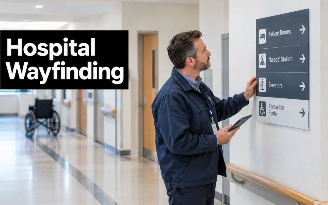
You're reviewing a ward move, reception keeps fielding the same directions question, and the replacement sign order is waiting for approval. Before approving artwork, check whether the patient can complete the journey. Hospital signage design is a clinical-safety and operations task, not just a choice of fonts, colours and panels.
Hospital Sign Types and What Each Must Achieve
| Sign type | Where it goes | Core requirement | Reference |
|---|---|---|---|
| Main entry identification | Street frontage and car parks | Identifiable from the street, car park and vehicle approaches | AusHFG entry guidance |
| Facility plan | Main and secondary entrances | Prominently placed; distinguishes staff, patient, visitor and restricted zones | AusHFG entry guidance |
| Emergency department identification | Every approach to the ED | Clearly identified from all approaches and illuminated for night arrivals | AusHFG emergency guidance |
| Triage and reception directions | Inside the ED entry | Easy to find, with consistent internal directions and clear exit routes | AusHFG emergency guidance |
| Room identification | Doors on accessible routes | Tactile and Braille information where users can approach and read it at close range | AusHFG signage guidance |
| After-hours alternative entrance | Locked access points | Directs people to an available alternative entrance | AusHFG entry guidance |
| Restricted area warning | Staff-only doors | Distinguishes staff and restricted zones from public areas | AusHFG entry guidance |
The AusHFG entry and zoning guidance establishes the entry, facility-plan, restricted-area and after-hours requirements. Treat the table as a procurement inventory, not permission to apply the same panel everywhere.
A patient arriving unwell at a regional emergency department after dark needs to recognise the correct entrance without searching the campus.
Following an October 2007 NSW inquiry into a miscarriage incident, recommendations called for uniform, prominent, concise, plain-language emergency information, including an instruction to notify a nurse immediately if the patient's condition changed. Those recommendations informed NSW Health's emergency-department signage implementation guidance.
Turn the inventory into a site record
Walk from the street to the destination and mark each required sign as:
- Present and effective: Visible on approach, accurate and readable.
- Missing: No suitable sign exists.
- Present but ineffective: The sign exists, but its position, wording or condition defeats its purpose.
For room identification signage, distinguish between seeing the destination from the corridor and approaching the tactile information. Those are different viewing tasks.
Record the failure location, not just the panel condition. A pristine sign behind an open door belongs in the ineffective category. These findings form the first draft of the sign inventory and identify where the team needs design work rather than like-for-like replacement.
Wayfinding as a Route, Not a Pile of Signs
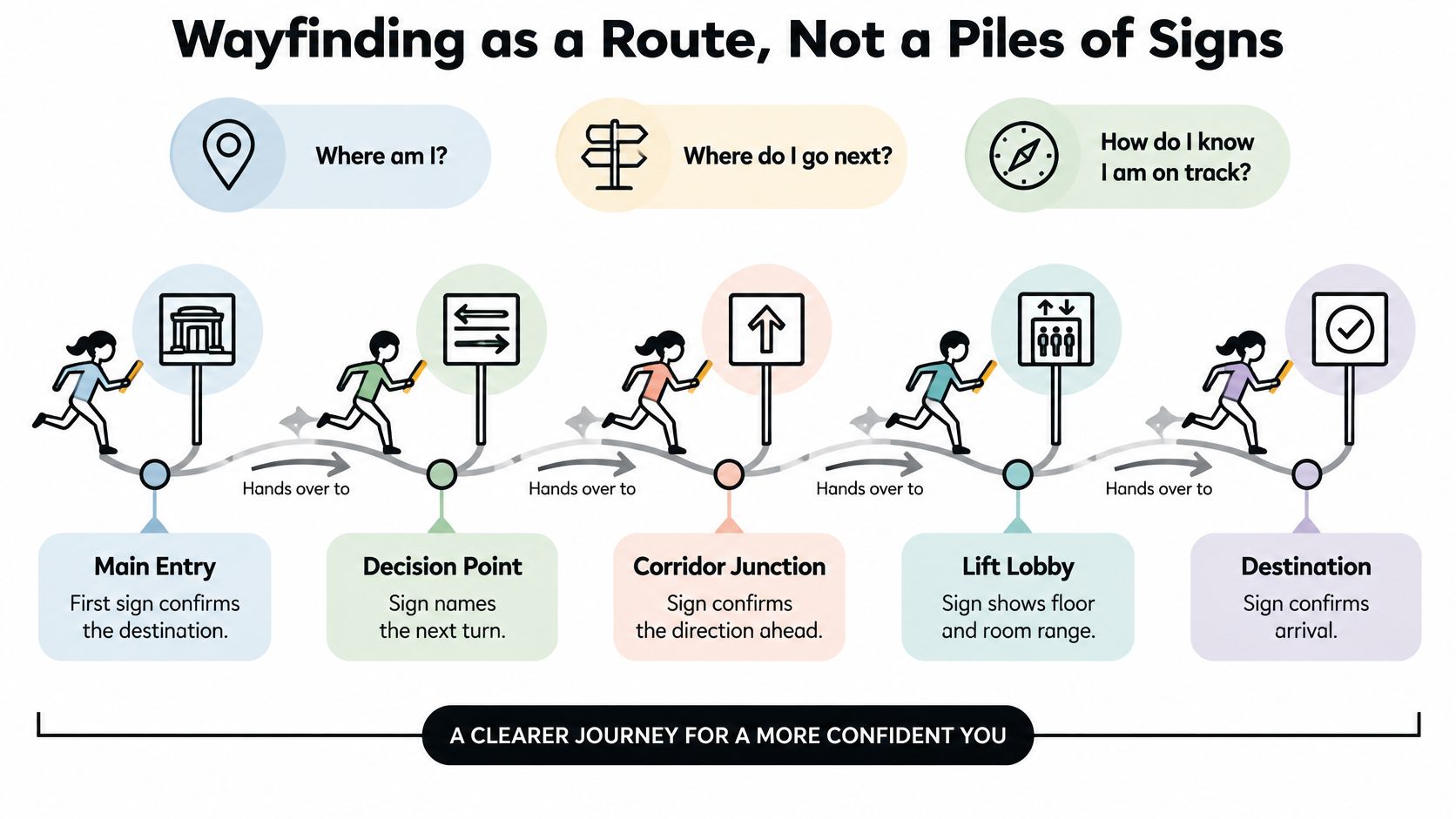
Think of wayfinding as a relay race. Each sign passes the visitor to the next decision point, where they need to understand where they are, which way to go and how far remains.
A decision point is a corridor junction, lift lobby or doorway where someone must choose. If the next instruction appears only after the turn, the handover has failed.
The route diagram illustrates that sequence.
Make the architecture and information agree
The AusHFG whole-facility wayfinding guidance calls for main-entry sightlines towards lift banks, stairs, main thoroughfares and major departments. Reception and public amenities should be recognisable without visitors having to reconstruct the route from scattered arrows.
A sign can confirm an architectural route. It can't make a hidden reception desk visible or remove a confusing choice between apparently identical corridors.
Consider a hypothetical naming failure: the wall sign says Imaging, while the appointment instructions and app say Radiology. A visitor may reasonably wonder whether these are different destinations and return to reception. The corrective action is an agreed destination name across every channel, not another arrow.
Use a destination register containing the approved public name, department identifier and location. Clinical teams can retain specialist terminology internally, but public-facing names need a controlled relationship to it.
Audit the complete journey
Fixed signs, wall maps, printed maps, kiosks, digital directories and QR-linked maps should support the same route. Digital formats are useful alternatives, not a reason to leave physical navigation incomplete.
Include these fields in the route audit:
- Journey information: Measured travel distance, estimated walking time and an accessible alternative.
- Decision-point evidence: Approach photographs, sightlines and the next visible instruction.
- Channel agreement: Matching destination names and floor references.
- Operational observation: Where people stop, turn back or ask for help.
Practical rule: Approve a route only when someone unfamiliar with it can move between decision points without inventing the missing instruction.
Walking-time information needs a stated basis and shouldn't imply that every patient moves at the same pace. Check the accessible route separately rather than assuming it follows the shortest path.
The procurement objective is fewer unnecessary choices and well-positioned instructions. Adding panels indiscriminately can make the visitor search harder for the instruction they need.
Complex Units and Alternative Formats
Mental-health and dementia units need more than the core sign inventory. Use calm, consistent wording, reduce ambiguous choices and keep destination names stable across entrances, appointment information and navigation channels.
NSW Health's whole-of-facility framework explicitly includes these complex environments and connects wayfinding with universal accessibility, auditing and remediation. It also places material performance within the navigation task, including matte finishes for legibility.
Plan the formats around the unit
Start with an entry-point list for each complex unit. Include the public approach, transfers from other departments and any alternative route used when normal access is unavailable.
Then agree the information each user needs:
- Emergency arrivals: Immediate recognition of reporting, triage and reception, with understandable onward directions.
- Patients with cognitive impairment: Consistent destination wording and fewer competing instructions.
- People with limited English: Locally appropriate language options and consistent pictograms.
- Users needing alternative formats: Braille, audio, kiosks or maps that can be viewed or listened to on a personal device.
Language options should preserve the plain-language structure of the English information. Don't translate a confusing paragraph and assume the accessibility problem is solved.
Test the complete set
Prepare a representative journey using the proposed fixed signs and alternative formats together. Check that a kiosk doesn't introduce a different name, an audio instruction doesn't omit a turn and a QR map doesn't send users through an unavailable door.
Invite people with cognitive impairment or limited English to test the relevant journeys with appropriate support and consent. Observe hesitation and requests for explanation rather than asking only whether the graphics look clear.
Prioritise these units in testing because misunderstanding can be particularly distressing there. Keep visible, legible fixed signs available even when supplementary formats are provided.
Accessibility and Regulatory Compliance for Hospital Signs
Australian requirements lead the specification. An overseas accessibility template isn't an adequate compliance basis for an Australian hospital.
Separate the applicable Australian standards, the AusHFG functional requirements and any overseas benchmarks included for comparison. Record which document and edition govern each scheduled sign, with the project's access consultant confirming unresolved details.
Establish the compliance basis
The AusHFG signage guidance connects letter size to reading distance and requires consideration of mounting heights, tactile and Braille information, lighting, glare and symbol size. That means compliance starts with measured conditions, not a catalogue's default panel.
| Element | Benchmark | Practical note | Reference |
|---|---|---|---|
| Visual sign letter size | Set from reading distance at each decision point | Measure the approach; don't apply one universal size | AusHFG signage guidance |
| Visual sign mounting height | Applicable Australian signage standard | Confirm the current applicable edition before approval | AusHFG signage guidance |
| Emergency department information boards | Viewing range under AS 1428.2:1992, as referenced by AusHFG | Check board readability separately from external night illumination | AusHFG emergency guidance |
| Tactile and Braille room identification | Close-range reading on accessible routes | Verify Braille specification and position; don't assume an imported Grade 2 template complies | AusHFG and project access review |
| Tactile character height | Verify against the applicable Australian standard | Record the approved value; verify any ADA cross-reference separately | Project access consultant |
| Raised character depth | Verify against the applicable Australian standard | Check the sample's edges for cleaning-cloth snagging | Project access consultant |
| Tactile sign mounting height | Verify the applicable accessible mounting range | Check standing and wheelchair approach conditions | Project access consultant |
| Text-to-background contrast | Verify the applicable contrast requirement | Specify matte surfaces and test under installed lighting | Australian standard and project specification |
| Pictogram and symbol size | Verify for the sign's function and viewing distance | Test the production-size sample from the actual approach | AusHFG signage guidance |
ADA benchmarks can be retained as a documented cross-reference where the project requires them. Don't insert unverified tactile dimensions, raised depths or mounting values into the Australian schedule merely because they appear in a supplier template.
Check emergency requirements separately
The AusHFG emergency-department guidance requires identification from every approach and illuminated signposting for night visibility. It also addresses triage, reception, internal directions, exits, toilets and hearing-augmentation signs, and references AS 1428.2:1992 for information-board viewing ranges.
Keep emergency access directions distinct from emergency egress requirements. The emergency exit signage requirements should be checked within the project's broader exit and evacuation review, not treated as ordinary departmental wayfinding.
Verify usability beyond the drawing
For visual destination text, specify a simple sans-serif typeface and mixed case. Avoid all-capital running instructions, and don't rely on colour alone to distinguish destinations. Tactile characters need their own standards review rather than automatic application of the visual typography rules.
Contrast can assist people with low vision, but colour treatments need testing with neurodiverse users too. Tactile floor treatments also need operational review where trolleys and clinical equipment travel.
Compliance approval belongs against a measured location and an approved sample, not just an artwork file.
Before sign-off, test representative routes with people who have low vision, dyslexia, limited English, cognitive impairment and mobility limitations. Record the problem, corrective action and retest result. A compliant component still needs to work within the installed system.
Materials and Finishes That Survive Clinical Cleaning
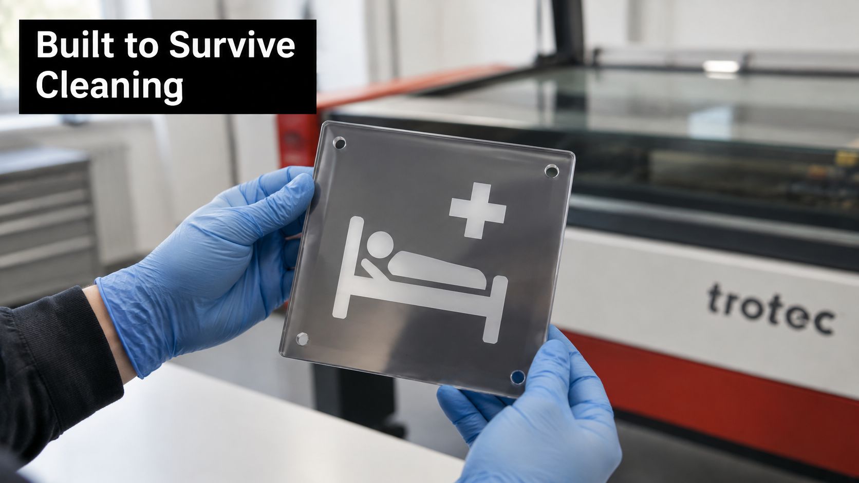
A sign can remain firmly attached and still fail clinically if its lettering fades, its finish clouds, or its surface reflects light into a visitor's sightline. Select and approve the whole construction, then check it against the cleaners and wiping routine used on the route.
Compare complete constructions
Use this comparison to shortlist options, not as proof of chemical compatibility. The substrate, coating, adhesive, marking and any colour fill all need to suit the hospital's cleaning products.
| Material | Durability | Cleaning tolerance | Best use | Watch out for |
|---|---|---|---|---|
| Laser-engraved stainless steel | Very high potential | Specify compatibility with the actual disinfectant and wiping routine | High-touch corridor, door and room signs | Higher cost; contrast depends on marking or filling method |
| Laser-engraved anodised aluminium | High potential | Check approved cleaners against the anodising | Directional panels and room identification | Harsh alkaline cleaners can affect the finish |
| Matte acrylic with engraved or printed text | Medium, construction-dependent | Validate wipes and avoid abrasive pads | Interior room and department identification | Scratching and damage to printed layers |
| Printed vinyl decal | Low to medium, application-dependent | Check wall surface, adhesive and cleaning exposure | Temporary signs and flexible wayfinding | Lifting seams; replace rather than patch |
| Glossy acrylic or glass | Medium, construction-dependent | Validate the complete assembly | Avoid as the default for primary navigation | Reflections can obscure text |
With stainless steel signs, approve the finished marking, not just the bare metal. The panel may last while its colour fill or surface treatment loses contrast. Check the approved sample under the lighting and from the approach where visitors must read it.
Specify marking and cleaning together
Laser engraving and marking alter or remove a surface layer on suitable materials. The resulting mark is not solely a layer of paint applied above the surface. Contrast still depends on the substrate and marking method, and any added fill needs its own compatibility check.
Evright Industrial provides laser engraving and marking, advises on materials, and supplies samples for approval before production. Use the sample to test the proposed cleaner and wiping routine on the complete sign construction before confirming the specification.
Record the cleaning method and inspection results in the maintenance schedule:
- Compatibility: Check the disinfectant instructions against the approved sign construction.
- Technique: Use a soft cloth and avoid abrasive pads. Confirm the wiping method against the finish supplier's guidance.
- Inspection: Check high-touch signs for fading, haze, edge lifting and reduced contrast. Record defects and actions taken.
Matte finishes are a practical starting point where glare could interfere with reading. During a route audit, note signs that cannot be read clearly from the visitor's approach, then verify whether reflections, cleaning damage or weakened contrast are responsible. Replace or re-specify a finish that fails that check.
How to Place Signs with the Right Sightlines and Heights
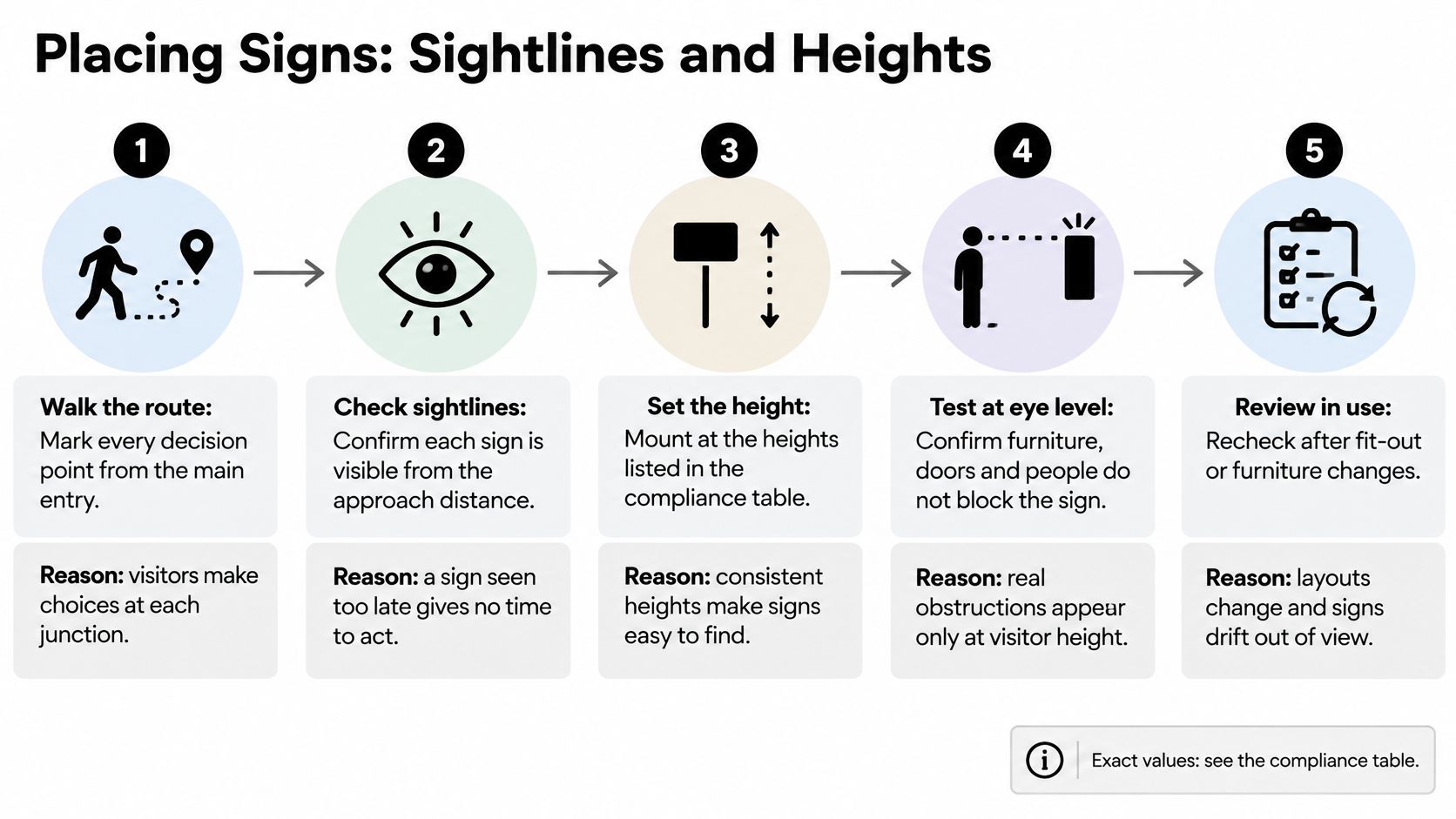
Placement starts where the visitor makes a choice, not where the installer finds convenient wall space. Use the compliance table to establish dimensions, then verify each location in the building.
This process graphic summarises the site checks.
Follow the route on site
- Mark the choices. Walk from the main entry and identify every junction, lift selection and destination doorway.
- Measure the actual reading position. Use the point where a visitor stops or needs to act, not an arbitrary distance from the wall.
- Apply the approved dimensions. Check letter size and mounting position against the compliance schedule and project specification.
- Verify tactile access. Confirm that users can approach, reach and read room-identification information without an obstruction.
- Inspect the sightline. Include parked beds, trolleys, bins, door swings and reflections from nearby glazing.
- Check changing illumination. Review night conditions and relevant emergency-lighting conditions. For external directional signs, apply the guidance on reflective lettering against a contrasting background.
- Complete the schedule. Record the sign ID, location, exact text, letter size, mounting height, material and approval status.
- Run an unfamiliar-user test. Walk the route with a staff member and a visitor who doesn't already know the building.
A sign can be at a comfortable reading height yet fail because it's halfway along the wrong corridor. The important check is whether users see it before committing to the choice.
Record evidence for acceptance
Photograph the installed sign from the scheduled approach, not only straight-on. Attach the photograph to its sign ID and record any obstruction requiring operational control.
Acceptance check: The visitor should see the instruction early enough to act without stopping in a doorway or reversing into circulation.
Include fit-out changes in the acceptance review. Furniture placed after installation can invalidate an otherwise sound location.
The following video can accompany the production discussion, but it doesn't replace the route measurements or compliance review.
Keeping Signs Accurate After Ward Changes
A stale sign actively directs someone to the wrong place. After a service move, that can be more misleading than an obvious information gap.
Treat signage changes as part of the ward-move programme. Don't leave the facilities team to discover contradictory panels after patients arrive.
Give the schedule an owner
Maintain a master sign schedule with a version identifier and named owner. Link physical signs, printed maps and digital destinations to that controlled information.
Define change triggers explicitly:
- Service changes: Ward moves, renamed departments and new clinics.
- Building changes: Renovations, new entrances and altered circulation.
- Access changes: Locked doors, temporary closures and changed after-hours arrangements.
For each trigger, name the approver, the removal point for superseded information and the coordinated release point for replacement channels. Temporary decals may suit transitional routes; stable destinations may justify rigid or engraved panels.
The important distinction is reversibility. Don't permanently mark information that the service team hasn't yet confirmed.
Measure the route after release
Repeat the acceptance walk after installation and after operational changes. Keep comparable records of requests for directions, route-completion time, staff assistance and navigation-related missed appointments, where those can be identified reliably.
These are diagnostic measures, not automatic proof of causation. Record the route and circumstances so a clinic delay isn't incorrectly attributed to signage.
| Symptom | Likely cause | Fix |
|---|---|---|
| Glare hides lettering at night | Gloss finish or bright backing panel | Replace with a matte finish and recheck contrast |
| Vinyl edges lift | Cleaning exposure or seam wear | Replace the affected panel; assess an engraved substrate for high-touch use |
| Room names are outdated after a ward move | Uncontrolled sign information | Update the schedule, revise the sign record and remove the old panel |
| Staff repeatedly give the same directions | Missing instruction where the question arises | Test a sign at that decision point |
| Kiosk and printed map disagree with signs | Separate update routines | Maintain a shared destination register |
| Tactile sign is hard to reach or read | Inappropriate mounting or obstructed approach | Remount against the approved accessible detail |
| Sign fades or deteriorates after disinfection | Incompatible cleaning product or finish | Review compatibility and replace the affected construction |
Give each defect an owner and closure record. Counting complaints without confirming the repair leaves the same failure available to the next visitor.
Examples of Hospital Signage That Worked
The useful Australian examples demonstrate better planning and evaluation methods. They don't all demonstrate measured improvements from completed installations, and procurement teams should preserve that distinction.
NSW turned an incident into a design requirement
The inquiry described earlier moved emergency information into the patient-safety discussion. Its practical contribution was to define what the information needed to achieve, rather than merely how a panel should look.
Copy the method: Start with the patient action the sign must support, then specify wording, prominence and location.
Canterbury Hospital offers a different lesson. In 2024 consultation, more than 88% of respondents said accessibility for people with disability and their families and carers was important, while signage and wayfinding were also identified as priorities in the NSW Government's consultation announcement.
That's evidence of community priorities, not a completed installation result. Copy the method: Bring patients, carers and disability access needs into the planning discussion before the sign package is fixed.
Use cost evidence carefully
A Victorian emergency-department wayfinding review cites research estimating that ineffective wayfinding cost a 604-bed regional hospital more than A$220,000 annually, or A$448 per bed.
Those reported figures shouldn't be treated as a guaranteed saving or transferred directly into another hospital's business case. Use them to justify examining local staff interruptions and navigation failures, then build the financial assessment from local observations.
The same guidance supports auditing the complete journey and considering accessible routes, language options and complementary formats. Copy the method: Cost the operational problem before choosing the replacement material.
Observe users rather than approving appearances
An HCCA healthcare-design advice paper describes University of Melbourne research across two children's hospitals, involving more than 180 hours of observation, surveys of over 600 patients, caregivers and staff, and focus groups and drawing exercises with children and siblings.
That approach examines design in use rather than relying solely on a mock-up. Copy the method: Include children, carers and staff in operational evaluation, and record what they do at confusing locations.
Confirm the Sign Specification Before You Order
Approve the order against an evidence package, not a collection of attractive proofs. The procurement team needs to know what each sign does, where it belongs and how the hospital will maintain it.
Complete the release checklist
- Inventory approval: Confirm existing, missing and ineffective signs, with a disposition for each superseded panel.
- Route approval: Include measured journeys, walking-time information, accessible alternatives and the agreed formats for complex units.
- Construction approval: Confirm viewing distances, mounting details and materials by zone. Assess engraved constructions for high-touch locations rather than assuming every finish is equally suitable.
- Compliance approval: Record the applicable AusHFG guidance and Australian standards, including the AS 1428 family where relevant. Identify any separately verified ADA comparison without substituting it for Australian requirements.
Resolve unknown dimensions before production. A verification note is useful during design, but it isn't a fabrication instruction.
Validate the highest-risk samples first
Check samples under clinical lighting and against the actual cleaning routine. Assess text contrast, tactile readability, edges, fixings and replacement access, not just colour matching.
We offer a sampling service for testing different materials and marking finishes, and customers can be invited onsite to see the production facility. Each customer has a dedicated project manager who works to the implementation schedule and budget and arranges required samples for approval before production.
Send the chosen supplier the completed inventory, controlled schedule and approved sample records. Release the full order only after the highest-risk zone samples and unresolved compliance details have been accepted.
Evright Industrial offers material and marking-finish samples to help facilities teams validate hospital signs before production, with a dedicated project manager coordinating approvals against the project schedule and budget. Visit Evright Industrial to start through the contact form, call the team or arrange an office visit, and bring your route audit and sign schedule to the discussion.
Recent Comments